Category Archives: Interface

Clean Slate

I’ve been cleaning a lot of the cruft out of my domains lately. Subdomains, development domains, MySQL databases originally setup to stage all sorts of nefarious dealings… they’ve all been pulled up by the roots and tossed into heaping piles of gzipped tarballs.

As part of this activity I’ve been cleaning out my Google Analytics account as well, as many of my analytic site profiles refer to domains long gone, testing procedures long concluded, directions I thought my web interests would go but didn’t. Having just made a Great and Terrible Mistake and irreversibly destroying a trove of information courtesy of the slop that is the Google Analytics interface, I have penned a cautionary tale to let you aware of two of its most dangerous functions: pagination and deletion.

Google Analytics Pagination: Party like it’s 1995 (and your 14.4K U.S. Robotics Sportster just arrived)

The pagination tool in Google Analytics defaults to displaying only 10 site profiles per page. Using the dropdown menu you can change this to 5, 10, 20, 35, 50 or 100.

An option to display only five profiles per page? What the hell? In what universe would that be useful? Are we seriously so pressed for bandwidth in 2010 that we cannot afford to peer at the world through more than a pinhole? Further, the cognitive load of needing to choose between six freaking options is ridiculous. It’s a modest burden to bear but oftentimes interfaces manage to kill their users not through a single fatal flaw, but through an endless series of tiny papercuts such as this.

Seriously, Google Analytics. If you must have pagination, limit the options to 10, 50 and All. And for all that is holy, remember my choice for at least the duration of my session. Needing to reset the number of rows every time I go back to my profile list is maddening, and the fact that I can’t save this option as a personal setting is driving me insane.

Or would drive me insane, if I hadn’t screwed up in a much bigger way. Pagination in Google Analytics has an additional feature whose destructive tendencies are so finely tuned that they trump even the above critique. To expand on this, we’ll take a quick stroll through the flawed workflow for deleting a site profile.

Deletion: With great power comes insufficient gravity and illustrative consequence surrounding said power.

To delete a site profile, you click the “Delete” link in its corresponding row:

When you click “Delete” a beautiful alert box pops up, a charming implementation of the “Hello World” of any beginner’s javascript tutorial:

In the alert box, the profile that will be deleted is not mentioned by name. It is up to you to remember, guess or assume which profile you originally clicked on. The most prominent information on this alert is the domain of the website that initiated the alert. Is that really the most important thing you need to know at this point, in order to make an informed decision? More important than the fact that the profile data cannot be recovered? More important than the name of the profile that’s actually being deleted?

Also note that “OK” is selected by default, so that pressing the return key will delete the profile. With an action as destructive as the irrecoverable deletion of years worth of information, it’s insanely poor form to select this choice by default.

Perhaps if creating a sensible “Delete” workflow in Google Analytics was as precious as maximizing clickthru rates on text ads, we’d see Google employing the same obsessive levels of testing that the color of hyperlinks currently enjoy. As it stands, all I can say is user experience my ass.

One Plus One Equals Gone

The ambiguous delete tool in Google Analytics, combined with its poorly-executed pagination functionality, creates a perfect storm of destruction. No matter what page you are on, when you click “OK” to confirm the deletion of a profile, Google Analytics redirects you to the first page of your profile list.


(The alert box for confirming the delete action appears over your current page. After clicking “OK” from the alert box you are redirected to the first page, losing the context of your delete action.)

Like most humans, I have a finely-tuned spatial memory. I instinctively take note of where things are located in space, I can predict where they will go, and I can remember where they were. If I’m performing a repetitive task, say spooning food into my mouth, I don’t check my plate after every bite to make sure it hasn’t turned into a bowl of snakes. There is an expectation, born from my experience with physical reality, that the plate and food will remain fairly consistent between mouthfuls such that it doesn’t demand constant conscious consideration. In the words of Heidegger, the spoon, plate and food are ready-to-hand, an extension of myself, part of my world of absorbed coping.

In Google Analytics I had identified two profiles that were outdated, and I moved to delete both of them. Spatially, they were located right next to each other, one after the other. I deleted the first one, and instinctively went to the location of the second one, and deleted it as well. The javascript alert, boldly declaring https://www.google.com/, was promptly ignored because it offered no useful information to confirm.

So long, dear friends.
Well, numerical representations of friends.

Unbeknownst to me, after deleting the first site profile I had been quietly redirected to the first page of my profiles list. And so, it came to pass that I deleted not the profile I intended to delete, but the profile documenting four years of activity here at Daneomatic. Clearly I’m not the first person to have accidentally (and irrecoverably) deleted a profile from Google Analytics.

Dear friends of Daneomatic, I ask that you enjoy your fresh start. Save your comments, I know nothing of you, of your browsers or activities or search terms.

Please, remake yourselves however you see fit. The gentle fellows at You Look Nice Today may offer some valuable suggestions as to how to best use this opportunity.

I, of course, would recommend the Mork from Ork suspenders.

A Multitasker’s Perspective: Behold, the Lowly Post-it Note

Check out Kord Campbell’s killer rig, complete with four monitors, at least two computers, two keyboards, an iPhone and an iPad.

Now, I don’t necessarily believe that multitasking is a bad thing, nor do I agree with Nicholas Carr and his assertion that the internet is ruining our ability to think.

I do believe, however, that multitasking and the ready availability of always-on, always-connected technology adversely affects my quality of life in many ways. And I do believe that I personally do not have the faculties necessary to deliberately manage these multiple, constant threads of information on my own.

Thus, my retreats into the woods. Externally-imposed isolation, where connectedness is not an option, is a very different beast than self-imposed isolation, and one I am far more fit to manage.

So, when I look at Campbell’s rig, I do not see it as an ideal to which to aspire, nor do I see it as a symbol of a computer-mediated life gone to horrible extreme. I simply see it as one person’s elaborate setup, their attempt to deal with the deluge of modern information, and I find it valuable and fascinating in its own right. I am here to observe, to sense-make, not to judge.

Really, I believe a focus on the number of screens misses the point, and what I find most interesting is the ecosystem that Campbell has created for himself.

Most poignant for me is the lowly Post-it Note, hanging off his primary monitor, front-and-center. For all the screens, all the software, the physical and spatial world was still implicated to record, display and remind Campbell of a few pressing tasks:

  • Signup breaks on template
  • Missing [frigge?] in add input
  • Trailing slashes on add input
  • Password reset issues

All recorded with pen and Post-it, and slapped up front on a 27″ monitor.

For all our screens, the physical, embodied world still holds significance and its own, rich meanings.

Introducing the Hans and Umbach Project

The Hans and Umbach Electro-Mechanical Computing Company

Last summer I began thinking about something that I referred to as “analog interactions”, those natural, in-the-world interactions we have with real, physical artifacts. My interest arose in response to a number of stimuli, one of which is the current trend towards smooth, glasslike capacitive touch screen devices. From iPhones to Droids to Nexus Ones to Mighty Mice to Joojoos to anticipated Apple tablets, there seems to a strong interest in eliminating the actual “touch” from our interactions with computational devices.

Glass capacitive touch screens allow for incredible flexibility in the display of and interaction with information. This is clearly demonstrated by the iPhone and iPod Touch, where software alone can change the keyboard configuration from letters to numbers to numeric keypads to different languages entirely.

A physical keyboard that needed to make the same adaptations would be quite a feat, and while the Optimus Maximus is an expensive step towards allowing such configurability in the display of keys, its buttons do not move, change shape or otherwise physically alter themselves in a manner similar to these touch screen keys. Chris Harrison and Scott Hudson, two PhD students at CMU, built a touch screen that uses small air chambers that allow it to feature physical (yet dynamically configurable) buttons.

From a convenience standpoint, capacitive touch screens make a lot of sense, in their ability to shrink input and output into one tiny package. Their form factor allows incredible latitude in using software to finely tune their interactions for particular applications. However, humans are creatures of a physical world that have an incredible capacity to sense, touch and interpret their surroundings. Our bodies have these well-developed skills that help us function as beings in the world, and I feel that capacitive touch screens, with their cold and static glass surfaces, insult the nuanced capabilities of the human senses.

Looking back, in an effort to look forward.

Musée Mécanique

Much of this coalesced in my mind during my summer in San Francisco, and specifically in my frequent trips to the Musee Mecanique. Thanks to its brilliant collection of turn-of-the-century penny arcade machines and automated musical instruments, I was continually impressed by the rich experiential qualities of these historic, pre-computational devices. From their lavish ornamentation to the deep stained woodgrain of their cabinets, from the way a sculpted metal handle feels in the hand to the smell of electricity in the air, the machines at the Musee Mecanique do an incredible job of engaging all the senses and offering a uniquely physical experience despite their primitive computational insides.

Off the Desktop and Into the World

It’s clear from the trajectory of computing that our points of interaction with computer systems are going to become increasingly delocalized, mobile and dispersed throughout our environment. While I am not yet ready to predict the demise of computing on a desktop (either through desktop or laptop computers alike), it is clear that our future interactions with computing are going to take place off the desktop, and out in the world with us. Indeed, I wrote about this on the Adaptive Path weblog while working there for the summer. Indeed, these interactions may supplement, rather than supplant, our usual eight-hour days in front of the glowing rectangle. This increased percentage of time that a person in the modern world would spend interacting with computing, even through any number of forms and methods, makes it all the more important that we consider the nature of these interactions, and deliberately model them in such a way that leverages our natural human abilities.

Embodiment

One model that can offer guidance in the design of these in-the-world computing interactions is the notion of embodiment, which as stated by Paul Dourish describes the common way in which we encounter physical reality in the everyday world. We deal with objects in the world–we see, touch and hear them–in real time and in real space. Embodiment is the property of our engagement with the world that allows us to interpret and make meaning of it, and the objects that we encounter in it. The physical world is the site and the setting for all human activity, and all theory, action and meaning arises out of our embodied engagement with the world.

From embodiment we can derive the idea of embodied interaction, which Dourish describes as the creation, manipulation and sharing of meaning through our engaged interaction with artifacts. Rather than situating meaning in the mind through typical models of cognition, embodied interaction posits that meaning arises out of our inescapable being-in-the-world. Indeed, our minds are necessarily situated in our bodies, and thus our bodies, our own embodiment in the world, plays a strong role in how we think about, interpret, understand, and make meaning about the world. Thus, theories of embodied interaction respect the human body as the source of information about the world, and take into account the user’s own embodiment as a resource when designing interactions.

Exploring Embodied Interaction and Physical Computing

And so, this semester I am pursuing an independent study into theories of embodied interaction, and practical applications of physical computing. For the sake of fun I am conducting this project under the guise of the Hans and Umbach Electro-Mechanical Computing Company, which is not actually a company, nor does it employ anyone by the name of Hans or Umbach.

In this line of inquiry I hope to untangle what it means when computing exists not just on a screen or on a desk, but is embedded in the space around us. I aim to explore the naturalness of in-the-world interactions, actions and behaviors that humans engage in every day without thinking, and how these can be leveraged to inform computer-augmented interactions that are more natural and intuitive. I am interested in exploring the boundary between the real/analog world (the physical world of time, space and objects in which we exist) and the virtual/digital world (the virtual world of digital information that effectively exists outside of physical space), and how this boundary is constructed and navigated.

Is it a false boundary, because the supposed “virtual” world can only be revealed to us by manipulating pixels or other artifacts in the “real” world? Is it a boundary that can be described in terms of the aesthetics of the experience with analog/digital artifacts, such as a note written on paper versus pixels representing words on a screen? Is it determined by the means of production, such as a laser-printed letter versus a typewriter-written letter on handmade paper? Is a handwritten letter more “analog” than an identical-looking letter printed off a high-quality printer? These are all questions I hope to address.

Interfacing Between the Digital and Analog

Paulo's Little Gadget by Han

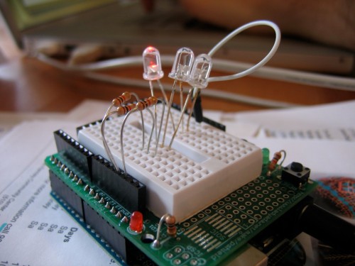
I aim to explore these questions by learning physical computing, and the Arduino platform in particular, as a mechanism for bridging the gap between digital information and analog artifacts. Electronics is something that is quite unfamiliar to me, and so I hope that this can be an opportunity to reflect on my own experience of learning something new. Given my experience as a web developer and my knowledge of programming, I find electronics to be a particularly interesting interface, because it seems to be a physical manifestation of the programmatic logic that I have only engaged with in a virtual manner. I have coded content management systems for websites, but I have not coded something that takes up physical space and directly influences artifacts in the physical world.

Within the coding metaphor of electronics, too, there are two separate-but-related manifestations. The first is the raw “coding” of circuits, with resistors and transistors and the like, to achieve a certain result. The second is the coding in Processing, a computer language, that I write in a text editor and upload to the Arduino board to make it work its magic. Indeed, the Arduino platform is an incredibly useful tool for physical computing that I hope to learn more about in the coming semester, but it does put a layer of mysticism between one and one’s understanding of electronics. Thus, in concert with my experiments with Arduino I will be working through the incredible Make: Electronics: Learning by Discovery book, which literally takes you from zero to hero in regards to electronics. And really, I know a bit already, but I am quite a zero at this point.

In Summary

Over the next few months I aim to study notions of embodiment, and embodied interaction in particular, in the context of learning and working with physical computing. As computing continues its delocalization and migration into our environment, it is important that existing interaction paradigms be challenged based on their appropriateness for new and different interactive contexts. The future of computing need not resemble the input and output devices that we currently associate with computers, despite the recognizable evolution of the capacitive touch screen paradigm. By deliberately designing for the embodied nature of human experience, we can create new interactive models that result in naturally rich, compelling and intuitive systems.

Welcome to the Hans and Umbach Electro-Mechanical Computing Company. It’s clearly going to be a busy, ambitious, somewhat dizzying semester.

Hot damn, I’m excited.

owl-iphone-banner-470

smartfm-evolution

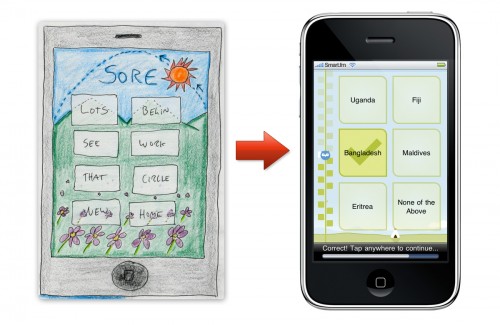
Smart.fm has submitted their iPhone app to Apple for approval. Their beautiful landing page for the app gives you a nice glimpse of what to expect.

I did the concept generation for the learning game experience while working at Adaptive Path for the summer. We had a kick-ass team, that included Alexa, Dan, Brian, and all the cool cats at smart.fm. They have all been chronicling their work on this project on the Adaptive Path blog.

I can’t wait to see this go live!

Separated at Birth

et-photoshop

Behold: ET: The Extra-Terrestrial and the new Photoshop Logo.

I gotta hand it to Adobe. They really knocked this one out of the park. I mean, look at that gloss. It just screams OS X Aqua circa 2000.

Yes, yes. The logo is old news, but it’s newly interesting now that you can host this ass of an icon on your iPhone.

From Analog Interactions to Tangible Bits

I spent a great deal of time this past summer turning the idea of “analog interactions” over in my head, carving and sanding and refining it through a series of essays.

It largely started in my post Analog Interactions, where I discussed my recent forays into Arduino and my increasing interest in historic, richly tactile interactions. Following that, in Scope I offered a brief summation of my obsessive excursions to the Musée Mecanique (caution, the link is LOUD) in San Francisco, studying their incredible collection of turn-of-the-century penny arcade machines.

Most recently, last week Adaptive Path published my blog post regarding my vision for the future of computing, as an embedded series of tangible, tactile interactions that reimagine the input and output devices we traditionally use to interact with computers. Off The Desktop and Into The World is thus my latest effort to describe a world of computing that naturally integrates with our rich human tradition as physical, feeling beings that exist in a physical, richly sensual world.

In pursuing my capstone project this year I’m continuing with this line of inquiry, but within a more specific context. As I move to introduce a level of academic rigor to my interest in these analog interactions, I believe Hiroshi Ishii’s Tangible bits: towards seamless interfaces between people, bits and atoms is going to be a key on-ramp into the conversation.

UPDATE: Holy shit. Did I read this paper in a dream or something? The parallels are uncanny. For instance:

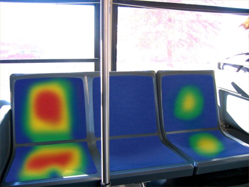
As an example, they described two cold steel benches located in different cities. When a person sits on one of these benches, a corresponding position on the other bench warms, and a bi-directional sound channel is opened. At the other location, after feeling the bench for “body heat,” another person can decide to make contact by sitting near the warmth.

What Ishii describes here is effectively a networked version of the Hot Seat:

hot-seat-01

Analog Interactions

Life has been wonderful and busy. As a hobby I’ve recently gotten into physical computing, and now properly armed with an Arduino board and a pile of spare parts from Sparkfun and Radio Shack alike I’ve started kinda hacking electronics and building junk. So far I’ve got nothing impressive to show for my efforts, but I’ve been learning a lot about circuits and resistors and transistors and I find myself uttering things that I never in my life thought I would say. Like, “These 1/6 watt 330 ohm resistors are absolute pussies when it comes to waterboarding. I mean breadboarding.”

But see, here’s the thing. Recently I’ve taken an interest into analog interactions, those things in the physical world that you interact with every day. You know, switches and knobs and dials and levers and the like. Or at least, that you used to interact with everyday, until someone got it in their head that everything needs to be a touch-sensitive computer screen interactive kiosk management database-backed networked system utility Ronald Reagan.

Now, I like touch screens as much as the next guy, but as humans, as physical beings that live in a physical, tangible world, I feel that touch screens are pedantic and insulting to the sophisticated sense of touch that we have developed over millennia. Thus, I’ve grown interested in 19th and early 20th century interactions, from slot machines to cash registers to antique cameras, in order to develop a interaction vocabulary that is more rich, nuanced and tactile than the ones we are currently using.

Yes, I’m looking backward to help us see forward. As the wise James Lileks recently said, “You might want to take a look into that big storehouse we call THE PAST, because it’s full of interesting, useful items.” Indeed, I’m curious about ways to take these old “analog” interactions and apply them to modern digital systems in such a way that the digital experience all but evaporates. All that remains on your interface, your beautiful hardwood interface, is levers, knobs, switches, perhaps a rotary dial. Indeed, the user would be “interacting” with a database-backed networked system, but all they would “experience” would be the physical controls and physical readouts. Like the Wooden Mirror for instance, which is backed by a digital computing mechanism, even though the computer does not constitute the experiential qualities of the interaction.

So that’s what I’m investigating, and that’s why I’m suddenly so interested in Arduino. It’s by far the easiest system available for getting started in physical computing. I can plug in a series of LEDs and push buttons, and in no time at all write a tiny script that tells a microcontroller how to interact with these input and output mechanisms. It’s cool stuff, and it gets me thinking of interactive systems beyond the conventional screen, keyboard and mouse paradigm.

Over the weekend I took a long jaunt through Noe Valley, up Twin Peaks and then down into Dolores. I ducked into an antique store to help jog my inspiration, and soon discovered that nothing in the store cost less than $3,000. There was a painting on the wall priced at $80,000. I took shallow breaths, lest my foul proletariat breath peel the varnishes from the $7,000 end tables.

On my way out I struck up a conversation with Isak Lindenauer, the curator of this fine antique store, and we proceeded to have an hour-long conversation about unconventional turn-of-the-century lamp controls that he has encountered in his profession. He mentioned a lamp switch, put out by the Wirt company in 1906, that featured not one, but two pull-chains, that one could use to adjust the brightness of the bulb. A hundred-year-old dimmer switch. Brilliant.

On Sunday I went on a 20-mile bike ride, headed south and then west past Stern Grove and Lake Merced, and taking the Ocean Highway north back to more familiar territory. I stopped at a coffee shop and struck up a conversation with an old-timer, on account of my “I’ve Been To Duluth” shirt. He was fascinated by the incredible innovation of mechanical engineers during the 19th century, and so our conversation covered the wide expanse of steam engines and books of pressure calculations. Once again the topic of interactivity came up, and we discussed railroad circuitry and analog computing machines and other technologies that seemed to come before their time.

I’m no expert on these matters, but I believe that when two random encounters in rapid succession both lead to invigorating conversations about a subject that you were already jamming on, that this is indicative that you are, dare we say, onto something.

“The Other Chris”

Huzzah! This morning I published my first post to the Adaptive Path weblog, and people have been stoked on it all day. I’ve been working on designing the iPhone application to go along with the smart.fm learning website, and a large part of my contribution to the project so far has been sketching. Sketching, sketching, sketching.

I talk about it all in the post, but I can summarize it here as well. Smart.fm has a series of awesome learning games, based on heavy research into human psychology, that are designed to help you learn and retain facts. They have totally hit a sweet spot with people trying to learn other languages, and with the iPhone app we wanted to help people continue their learning, any place, any time. Their existing web-based games feature a sort of “flash cards on steroids” rhythm, which turns out to be a great functional description, but a poor metaphor for their actual gamelike feel. Thus, our goal with the iPhone app is to design something that perhaps resembles index cards at its most basic level, but from an experiential standpoint is a hell of a lot more fun.

Interaction Metaphor Explorations

And so, we began exploring metaphors. What makes something fun? What makes something gamelike? Alexa and Dan turned me loose with my sketchbook, and I began brainstorming enormous lists around such concepts as the materiality of the gamespace, the movements people perform to interact with the artifacts in the game, and how to best represent time and progress. I generated dozens and dozens of ideas, drawing inspiration from dollar store games to radio dials to Wooly Willy. Throughout my thought process I roughed these guys out on paper, giving ourselves a constant stream of tangible artifacts to look at, reflect on, believe in, or challenge. I talk about this process a bit more in this video, where I walk through my sketchbook with Chris and John, my fellow summer associates.

From these explorations I brought a few ideas up into a bit more coherence, which I talk about here:

"Your World" Concept

We shared all this work with the client, who is absolutely stoked with it. In their blog post regarding this project they speak of a “super-talented summer associate” who produced some pretty cool visual explorations, but when they say that I wonder if they have me confused with Dave Pederson (a.k.a. “The Other Chris”, a.k.a. “The Mysterious Fourth Intern”).

Again, the thread at the Adaptive Path blog can fill you in on all the details. Needless to day, it is an absolute delight working with the fine folks at Cerego, and it is all thanks to them that we can be so open about our process in designing their iPhone app.

Oliver’s Simple Fluid Dynamics Generator

God damn this is cool. Click and drag in the black square to make the magic happen. Works best in the smokin’ Safari 4.0, because this beast is heavy on the Javascript. In any other browser you’ll wonder what in the hell I’m gettin’ so worked up about.

Stuff like this just feeds my existing obsession with introducing deliberate thought and consideration into the texture and materiality of our digital interfaces. Seriously, computer interaction that exhibits natural physical properties, either felt, observed or otherwise perceived, really gets my blood going.

fluid-dynamics

Collapsing Navigation in jQuery

collapsing-nav-screenshot

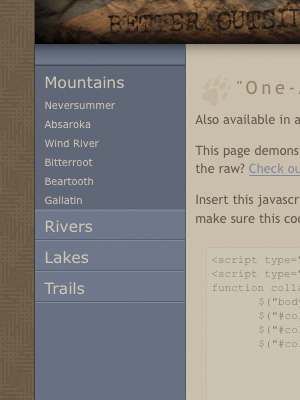
Accordion menus, collapsing navigation, f’eh. Everyone’s got their own version, including the one native to jQuery UI. I’ve never really been satisfied with any of them, however, so I took a stab at rolling my own. I built it in two versions, one that only allows you to have one navigation section open one at a time, and one that allows multiple sections.

If you have poor impulse control and just want to skip to the code demos, you can check out the implementations here:

Stylized “One-At-A-Time” Collapsing Navigation
Stylized “Many-At-A-Time” Collapsing Navigation

Making the magic sauce.

Here’s the basic code that makes it happen. I’ll only outline the “one-at-a-time” implementation here, but the “many-at-a-time” version is remarkably similar. All these code examples are available on the demo pages as well.

First, use this HTML code, or something similar to it. Basically, what you need is a series of double-nested unordered lists with the proper ID.

<ul id="collapsing-nav">
	<li><span>Main Nav One</span>
		<ul>
			<li><a href="#">Sub Nav One</a></li>
			<li><a href="#">Sub Nav Two</a></li>
			<li><a href="#">Sub Nav Three</a></li>
		</ul>
	</li>
	<li><span>Main Nav Two</span>
		<ul>
			<li><a href="#">Sub Nav One</a></li>
			<li><a href="#">Sub Nav Two</a></li>
			<li><a href="#">Sub Nav Three</a></li>
		</ul>
	</li>
	<li><span>Main Nav Three</span>
		<ul>
			<li><a href="#">Sub Nav One</a></li>
			<li><a href="#">Sub Nav Two</a></li>
			<li><a href="#">Sub Nav Three</a></li>
		</ul>
	</li>
</ul>

Next, these are the raw CSS styles that you’ll need to create the effect. Once you understand what’s going on, feel free to customize these rules however you see fit.

<style type="text/css">
	ul#collapsing-nav li a {
		color: #00f;
		text-decoration: underline;
	}

	ul#collapsing-nav li a:hover {
		color: #f00;
	}

	body.enhanced ul#collapsing-nav span {
		color: #00f;
		text-decoration: underline;
	}

	body.enhanced ul#collapsing-nav span:hover {
		color: #f00;
		cursor: pointer;
	}

	body.enhanced ul#collapsing-nav li.selected span,
	body.enhanced ul#collapsing-nav li.selected span:hover {
		color: #000;
		cursor: default;
		text-decoration: none;
	}
</style>

Finally, insert this JavaScript in the <head> of your HTML page. Also, grab a copy of jQuery and make sure this code points to that file as well.

<script type="text/javascript" src="jquery.js"></script>
<script type="text/javascript">
function collapsing_nav() {
	$("body").addClass("enhanced");
	$("#collapsing-nav > li:first").addClass("selected");
	$("#collapsing-nav > li").not(":first").find("ul").hide();
	$("#collapsing-nav > li span").click(function() {
		if ($(this).parent().find("ul").is(":hidden")) {
			$("#collapsing-nav ul:visible").slideUp("fast");
			$("#collapsing-nav > li").removeClass("selected");
			$(this).parent().addClass("selected");
			$(this).parent().find("ul").slideDown("fast");
		}
	});
}
$(collapsing_nav);
</script>

The above code adds an “enhanced” class to the <body> element, marks the first navigation section in the unordered list with a “selected” class, and hides all the remaining sections. When the user clicks on a section heading it hides any open navigation sections, reveals the section that corresponds to the clicked heading, and marks that section as selected.

If you want to see this basic code in action, visit the basic demo page or download these code examples for your own nefarious purposes.

There are a few things that make this collapsing navigation better than a lot of the other crud out there. While I certainly wouldn’t purport that this is the best of the best, I’ve found it to be perfectly suitable for many of my purposes.

It’s easy to implement and customize.

Just add the proper ID to a double-nested unordered list with the proper HTML markup, and you’re good to go. You’ll have to do some work with the CSS to get it to look good and behave just the way you want, but in the basic code example I’ve sketched out the behavioral CSS scaffolding that you’ll need to get off the ground. In the designed example I’ve compartmentalized the CSS rules across a few files, to clearly delineate what code applies to the navigation, and what is purely ornamentation.

It’s compatible.

I’ve tested these examples and they work perfectly in Safari 3.2.1, Firefox 3.0.6, Opera 9.63 and Internet Explorer 7.0. They work in IE 6.0 as well, with one small caveat: IE6 doesn’t support the :hover pseudo-class on any element other than <a> elements, and since the section headings use spans instead of hyperlinks, the hover state doesn’t work. This is a bummer, but if you tweaked the JavaScript to add an “ie-hover” class to the <span> element on hover, and if you defined that class in the CSS, you could totally work around this. For me it isn’t worth the effort, as I believe that IE6 users should be forced to browse the web in constant agony. For you, this activity could be a learning experience.

It’s lightweight.

Simply bring in 46KB of jQuery hotness, and the JavaScript and CSS to make this puppy work weighs less than 5KB.

It degrades gracefully with JavaScript turned off.

All nested lists are displayed wide open by default, so all navigation items are available to the user. Additionally, when JavaScript is disabled the section headings are not hyperlinked and are not clickable, as one would reasonably expect, considering that the only reason they should be clickable is to toggle the list. Without JavaScript to collapse and uncollapse the navigation, the hyperlink would serve no purpose other than to confuse the user. Indeed, if something isn’t clickable in a particular use case, it shouldn’t have an affordance that suggests otherwise. This lack of attention to detail in so many slipshod JavaScript snippets annoys me to no end.

I achieve this effect by using <span> elements (rather than <a> elements) to wrap the first-level list items. These spans could certainly be replaced by something like a header element that would more semantically descriptive, but such is a task I leave up to the reader. Then, with JavaScript I add an “enhanced” class to the <body> element, which calls in the basic CSS styles that control the presentation of the first-level list items and make them behave as clickable headings. This abstraction of presentation and behavior ensures that the collapsing navigation works as expected in most cases, and that those browsing without JavaScript will enjoy an experience unsullied by irrelevant controls.

It behaves the way you think it should.

Which is more than you can say about a lot of collapsing menus out there.

The section headers aren’t clickable when they shouldn’t be clickable, such as when they’re already expanded in the “one-at-a-time” example, or in cases where JavaScript is disabled.

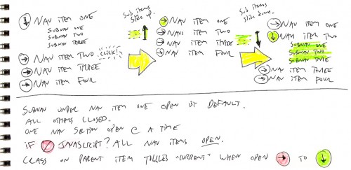
As with all of the things I design these days, I didn’t start with code when I set out to build this navigation. I started with sketching, which helped me better grasp the behavioral requirements of such a navigation scheme.

collapsing-nav-sketches

Sketching helped me realize one core problem that needed to be solved, that the first item in the list needed to be expanded by default. Indeed, there’s no reason that all navigation items should start out closed, as that’s lazy and inane. Second, this offers an affordance to the user, suggesting the behavior that can be expected from the other navigation items.

So that’s that. Visit the demo page to see the hotness stylized, or check out the basic code that makes the magic happen.