Your Online Banking System Can Go To Hell

online-statements

Dear Online Statements,

I have paper records that go back ten years. Ten years. These records do not expire. You propose that I enroll in a “convenient” system that forgets my records after a mere 18 months. If I want to access records older than that you will charge me a fee and send them via U.S. mail, which is what you were doing in the first place.

If your online system is so “secure” why can’t you entrust it with more than 18 months worth of records? If it is so “convenient” why does it do a worse job of managing my account history than I do?

This is supposed to sound compelling why?

Regards,
Dane

P.S. If you ever again mention the “greenness” of online statements versus mailed statements, so help me god I will claw out your throat. There is nothing green about a server farm that needs to run white-hot 24 hours a day, seven days a week, to allow me “access” to my “statements” whenever I “want”.

I’ll tell you what’s green and convenient, and it’s a fucking file cabinet.

JJ Abrams Is All Over The New Star Trek Movie

And the world is a better place for it.

  • Location names are set in Futura. Come to think of it, Futura is all over the place.
  • They discuss “Slusho” in the bar at the beginning of the movie.
  • I swear one of the doctors who delivered James Kirk was the scientist from the Dharma Initiative videos in Lost.
  • Angry ice world beast thing looks like a puppy version of the Cloverfield angry beast thing.
  • Time travel.
  • Movie totally kicked ass and I want to see it again.
  • And again and again.

Freshening up my sewing skills.

You *wish* you were bookbinding.

That’s right, you wish you were bookbinding tonight.

Dane and James’ Lost Dreams

Dane and James' Lost Dreams

Chances are my handwriting is blowing your mind right about now, so allow me to translate:

“Dane and James’ Lost Dreams!”

Cruise Ship + Roller Coaster = Awesome.

Smoke (cruise ship also makes dirt bike sounds) BRAAP-BRAAP!

PROBLEM: No one is signing up for spring break in Cancun for 2010… some say it’s too early, but those people are wrong (and probably stupid, too). We say it’s because of SWINE FLU (aka H1N1, for that bitchy pig lobby).

…just means more bacon for the rest of us.

SOLUTION: “Dane and James’ Lost Dreams,” a cruise ship that caters to the real target user group of cruise ships!

  • People who own Harley Davidson t-shirts (but no longer have the sleeves to go along with them) – used to be black, but went through the wash too many times…
  • People with fanny packs (preferably in bright colors).
  • People who have a favorite monster truck driver.
  • People with multiple chins.
  • People who shouldn’t wear swimsuits, nor own them.
  • People who live in dorms, or still wish they did.

FUCK THE CASINO. We’re doing an entire deck of mini-fridges and microwaves and TV dinners. (not to mention TV desserts!)

VODKA + JELLO CAKE = VODELLO CAKE

Luxurious Double-Wide Toilet Paper
America demands Brawny on its ass.

Mother of All Funk Chords

I found this months ago, and watching it still gives me chills:

This was the reason the internet was invented, man.

Rounding the Corner

Today was one of the best days I’ve had in months, and I don’t think it can be entirely attributed to my massive caffeine intake.

I spent my entire morning grading assignments, drinking yerba maté, and watching small birds dine at our feeder. We are most frequented by house finches, and at one point we had six of them fluttering about on our deck. The chickadees are rather entertaining, how they grasp sunflower seeds between their feet and noisily peck them open. This morning we were even paid a visit by a male red bellied woodpecker, who was quite enormous considering our bird feeder is no larger than a cigar box.

My love for these birds isn’t universal, however. I hate the sparrows, or as I call them, hobo finches.

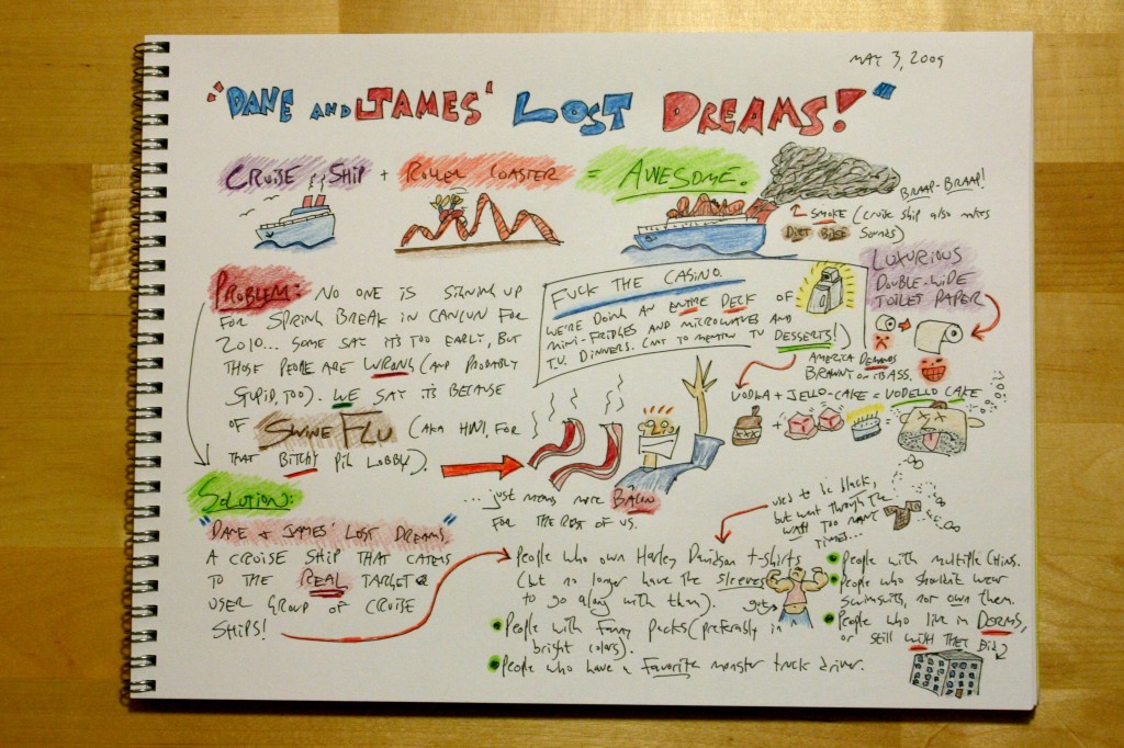
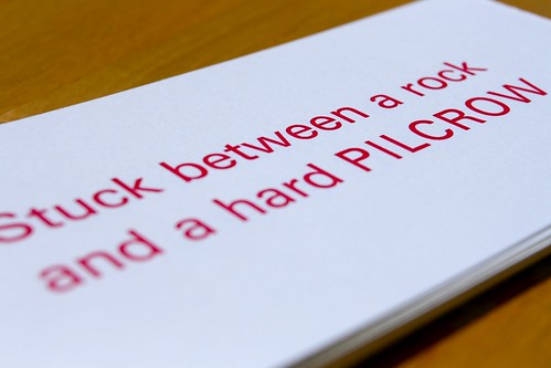
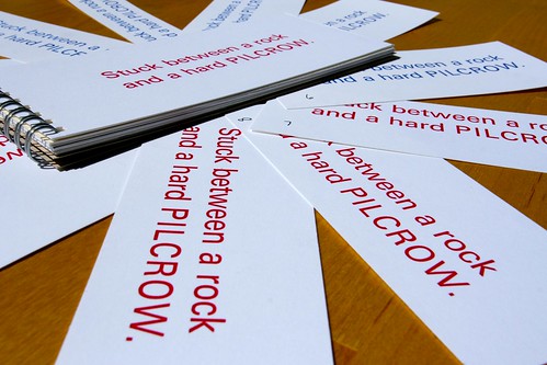
As most great stories often end, eventually I had to go to school. Today we were sharing and critiquing proofs for our final typography project, and my “Western U.S. ruggedness meets European luxury via turn-of-the-century railway hotels” concept for an Akzidenz-Grotesk specimen book went over well. I got a lot of really good feedback from my classmates, too, and I’m excited to continue refining my work.

After hearing everyone share horror stories about color printing and registration and all that “recto-verso” jazz, however, I must say I’m a tad apprehensive about this whole “physical materiality” thing. I definitely want to move beyond the intangible nature of digital work, but the hardships of producing a double-sided color print sound akin to sailing the Cape Horn, and leave me wondering how the heck I’m going to pull this thing off. I don’t know what kind (or even size, for that matter) of paper I’m going to use, and I certainly don’t know how I’m going to slap ink on it… let alone more than one color of ink. And sheesh, more than one side? Maybe Kinko’s will save my ass.

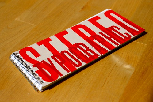
However, last night I did put together a couple of book binding prototypes, properly armed with a stapler, stylish paper, this week’s 20%-off coupon from Bed Bath & Beyond, and Super 77:

img_8438

And folks, Super 77 needs to be inducted into the Periodic Table of Awesomements, like, yesterday.

But seriously, I almost shed a tear today when our final typography class came to a close. I’ve learned so much in that class, from history to composition to gestalt to kerning to grids to the innumerable parallels between graphic and interaction design, that it’s hard to believe it’s only been four months since we started. Sheesh, I got to work with printing presses, real mechanical printing presses with heavy gears that will pinch your fingers, and rollers that will tear the hair right off your head. Risking life and limb? that’s what we call design, baby.

Type Cliché Letterpress Project

Type Cliché Letterpress Project

Type Cliché Letterpress Project

Type Cliché Letterpress Project

The day wrapped up with an evening meeting with my experience design team. We’re in the process of prototyping a museum installation where people learn about light by playing with mirrors and prisms.

img_8424

img_8425

img_8426

img_8435

There are some particularly subtle experiences we’re trying to recreate, not the least of which involve producing an immersive environment that suspends time and encourages focused, exploratory behavior. Our installation is designed to be fun, but we’ve described ours as a kind of “PBS fun” rather than “Nickelodeon fun.” Further, we’re introducing a social aspect that allows others to indirectly engage with (or contribute to) the experience, which will involve a separate prototype that we hope to build this weekend.

With flashlights. And Saran Wrap. And Sharpies, toilet paper tubes, duct tape, an iPod on repeat, and a dark, dark room. As our professor so lovingly told us the other day, “You guys are poor graduate students. You’ll build prototypes out of whatever garbage you can get your hands on.”

And so we did. And so we will.

Don’t make me experience prototype your face.

I have at least three projects due in the next week, each of which demands that I know a different piece of Adobe® software, including Illustrator, Premiere Pro, InDesign and After Effects. My love affair with Adobe® is well-documented, as is their software, which features tons of videos put together by kind people who explain things slowly, and in basic terms that I should be able to understand.

Nevertheless, after spending the entire evening trying to learn After Effects, I have thusly concluded that I cannot be taught. For me it will have to be scissors, construction paper and lots of hand-waving, from now until the foreseeable future.

Wood Type for All

Ever since I became aware of its existence, I have wanted to visit the Hamilton Wood Type Museum in Two Rivers. Until then I will have to be satisfied with drooling over the Unicorn Graphics Online Wood Type Museum, which features a digital cornucopia of specimens from a bygone era.

The centerpiece of their online collection is definitely the Hamilton Wood Type Catalog #14, which they have lovingly scanned in its entirety. Hoefler & Frere-Jones have already waxed poetic about this collection. If a gorgeous page like this doesn’t make you freak out just a little, you might be running in the wrong crowd. Foils dude, look at them foils:

Hamilton Wood Type

Fame and Fortune

There’s just something kinda cool about being in the ACM Digital Library:

Our CHI paper has found its way into the ACM Digital Library.

If you’re a hopeless nerd, that is.

Summation

Our trip to Boston was great. Our favorite part was the cemeteries.

The CHI Student Design Competition went well. Our poster went through about fifteen revisions until we called it good, but all that hard work definitely paid off:

CHI Poster Revision Animation

Out of twelve finalists who presented posters, our team was one of four chosen to advance to the final round. Thus, we spent the next three days with our faces in our laptops, putting in 17-hour days working on our design presentation. We didn’t get to see a whole lot of CHI as a result, but we pulled down fourth place in the design competition, which is pretty cool considering there were, like, 70 original submissions.

As an aside, I’m not so sure that having the final round be a “competition” between four teams is really the most productive way to advance the state-of-the-art of academic interaction design instruction. Rather, a panel where each team openly shares its design process, discussing any hardships, techniques or insights discovered along the way, would encourage collaboration, and redirect competitive energies towards actually improving design education in the world. Interaction design is far too young a field, and there are still far too few of us in the community, for us to be actively snapping at one another.

So that’s that. Boston rocks. CHI existed. Jon Kolko is awesome.

Meanwhile, I really need a haircut. Fortunately I have been signed up for an extra-swanky one this summer, as I’m going to be working as an intern at Adaptive Path. Yes. Five years ago I slept in my car on my drive from Bend to San Francisco, to attend a series of workshops about redesigning Blogger and building Basecamp. Those workshops, hosted by none other than Adaptive Path, blew my mind wide open in regards to human-centered design, and set me on the path that ultimately led to the HCI/d program at Indiana University.

Yes. Adaptive Path. Needless to say, rollin’ with those homies is an honor beyond my wildest dreams, and I can barely sleep at night out of excitement for what awaits. It’s been a lot of hard work, a ton of thanklessly hard work, to get to this point, but it’s beginning to seem as though it was all worthwhile.

Meanwhile, how about a few samples of some stuff I’ve been cookin’ up, lately? I’m putting together an Akzidenz-Grotesk type specimen book for my typography class, and my theme is “European opulence meets American ruggedness, via turn-of-the-century railway hotels.”

specimen-book-1

specimen-book-2

specimen-book-3

It’s still a work in progress. Notably absent is any usage whatsoever of the typeface Akzidenz-Grotesk.

And finally, this is just plain awesome:

“It doesn’t fit in a Rolodex, because it doesn’t belong in a Rolodex.”