Category Archives: Development

Splitting Subversion into Multiple Git Repositories

For the last three years I’ve been maintaining all my projects and websites, including Daneomatic and Brainside Out, as well as I’ve Been To Duluth and Terra and Rosco and Siskiwit, in a single Subversion repository. At any given time I find myself tinkering with a number of different projects, and honestly it keeps me awake at night if I’m not tracking that work in some form of version control. Given the number of projects I work on, and my tendency to abandon them and start new ones, I didn’t feel it necessary to maintain a separate repository for each individual project.

Subversion is, frankly, kind of a stupid versioning system, which actually works to the favor of someone wanting to manage multiple projects in a single repository. Since it’s easy to checkout individual folders, rather than the entire repository itself, all you need to do is create a unique folder for each individual project. Unlike Git, the trunk, tag and branches are just folders in Subversion, so you can easily compartmentalize projects using a folder hierarchy.

This approach creates a terribly twisted and intertwined history of commits, with each project wrapped around the other. My goal, however, was not necessarily good version control, but any version control at all. Like living, keeping multiple projects in the same repo beats the alternative.

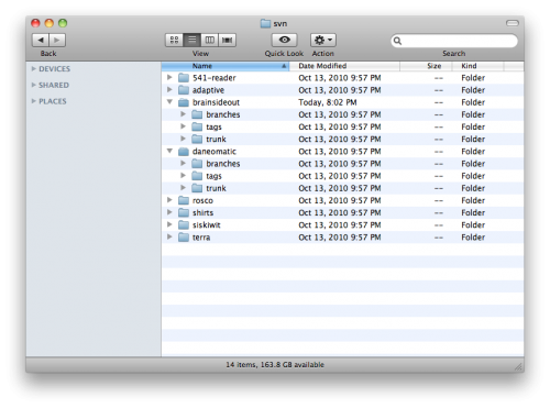
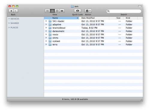
The folder hierarchy of my Subversion repository looks like this. Each project has its own folder:

Within each project is the standard folder structure for branches, tags and trunk:

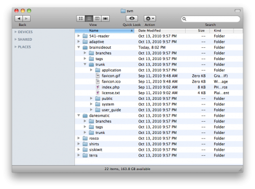
In the trunk folder is the file structure of the project itself. Here’s the trunk for one of my CodeIgniter projects:

While it’s generally bad practice to keep multiple projects in the same repository in Subversion, near as I can tell it’s truly a recipe for disaster in Git. Git is real smart about a lot of things, including tagging and branching and fundamentally offering a distributed version control system (read: a local copy of your entire revision history), but that smartness will make your brain ache if you try to independently maintain multiple projects in the same repository on your local machine.

And so it came to pass that I wanted to convert my single Subversion repository into eight separate Git repositories; one for each of the projects I had been tracking. There are many wonderful tutorials available for handling the generic conversion of a Subversion repo to Git, but none that outlined how to manage this split.

I hope to shed some light on this process. These instructions are heavily influenced by Paul Dowman’s excellent post on the same subject, with the extra twist of splitting a single Subversion repository into multiple Git repositories. I would highly recommend you read through his instructions as well.

First things first: Install and configure Git.

First, I installed Git. I’m on OS X, and while I’m sure you can do this on Windows, I haven’t the foggiest how you would go about it.

After installing Git I had to do some initial global configuration, setting up my name and address and such. There are other tutorials that tell you how to do that, but ultimately it’s two commands in Terminal:

[prompt]$ git config --global user.name "Your Name"
[prompt]$ git config --global user.email [email protected]

Also, I needed to setup SSH keys between my local machine and a remote server, as the ultimate goal of this undertaking was to push my Git repositories to the cloud. I have an account at Beanstalk that allows me to host multiple repositories, and they have a great tutorial on setting up SSH keys in their environment. GitHub has a helpful tutorial on SSH keys as well.

Give yourself some space.

Next, I created a folder where I was going to do my business. I called it git_convert:

Then, I created a file in git_convert called authors.txt, which maps each user from my Subversion repository onto a full name and email address for my forthcoming Git repositories. My authors.txt file is super basic, as I’m the only dude who’s been rooting around in this repository. All it contains is this single line of text:

dane = Dane Petersen <[email protected]>

Now crank that Soulja Boy!

Now comes the good stuff. The git svn command will grab a remote Subversion repository, and convert it to a Git repository in a specified folder on my local machine. Paul Dowman’s tutorial is super handy, but it took some experimentation before I discovered that git svn works not only for an entire repository, but for its subfolders as well. All I needed to do was append the path for the corresponding project to the URL for the repository itself.

What’s awesome, too, is that if you convert a subfolder of your Subversion repository to Git, git svn will leave all the other cruft behind, and will convert only the files and commits that are relevant for that particular folder. So, if you have a 100 MB repository that you’re converting to eight Git repositories, you’re not going to end up with 800 MB worth of redundant garbage. Sick, bro!

After firing up Terminal and navigating to my git_convert directory, I used the following command to clone a subfolder of my remote Subversion repository into a new local Git repository:

[prompt]$ git svn clone http://brainsideout.svn.beanstalkapp.com/brainsideout/brainsideout --no-metadata -A authors.txt -t tags -b branches -T trunk git_brainsideout

After some churning, that created a new folder called ‘git_brainsideout’ in my git_convert folder:

That folder’s contents are an exact copy of the corresponding project’s trunk folder of my remote Subversion repository:

You’ll notice that the trunk, tags and branches folders have all disappeared. That’s because my git svn command mapped them to their appropriate places within Git, and also because Git is awesomely smart in how it handles tags and branches. Dowman has some additional commands you may want to consider for cleaning up after your tags and branches, but this is all it took for me to get up and running.

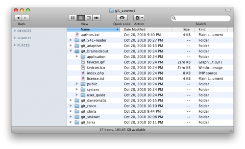
Using git svn in the above manner, I eventually converted all my Subversion projects into separate local Git repositories:

Again, the trunk, tag and branches folders are gone, mapped and replaced by the invisibly magic files of Git:

Push your efforts into the cloud.

I had a few empty remote Git repositories at Beanstalk where I wanted all my hard work to live, so my last step was pushing my local repositories up to my Git server. First, I navigated into the desired local Git repository, and setup a name for the remote repository using the remote command:

[prompt]$ git remote add beanstalk [email protected]:/brainsideout.git

I had previously setup my SSH keys, so it was easy to push my local repository to the remote location:

[prompt]$ git push beanstalk master

Bam. Dead. Done. So long, Subversion!

For more information on how to get rollin’ with Git, check out the official git/svn crash course, or Git for the lazy.

Happy Gitting!
Your Workflow is the Battlefield

There’s been quite the wailing and gnashing of teeth over the Apple iPad not supporting Flash. Personally, I welcome this new landscape of the web, where a future without Flash seems not only bright but possible indeed.

That said, what is unfolding here is of considerable gravity, and will likely determine the future of the web. Most web professionals use Adobe tools in some capacity to do their job, whether Photoshop, Illustrator, Dreamweaver (gasp), Flash, Flex, Flash Cataylst, or even Fireworks (which is, according to many, the best wireframing tool on the market, despite its quirks and crash-prone behaviors).

Now, I am not privy to inside information, but based on what I’ve been able to glean, Adobe’s strategy is something like this. There is a deliberate reason that your workflow as a standards-based web professional sucks; that Photoshop doesn’t behave the way you want it to, that exporting web images is still a pain in the ass, and that you actually need to fight the software to get it to do what you want.

Adobe knows how you use its software. Adobe knows how you want to use its software. Adobe understands your existing workflow.

And it doesn’t fucking care.

You see, Adobe doesn’t view you, as a web professional, as someone engaged in building websites. It doesn’t view itself as one who builds the tools to support you in your job. Adobe does not view you as the author of images and CSS and HTML and Javascript that all magically comes together to create a website, but rather as the author of what could potentially be Adobe Web Properties™.

They are not interested in supporting your workflow to create standards-based websites, because that is not in their strategic interest. They would much rather you consented to the cognitive model of Adobe Software™ to create proprietary Adobe Web Properties™ that render using Adobe Web Technologies™.

In essence, Adobe wants to be the gatekeeper for the production, as well as the consumption, of the web.

Apple knows this, and knows that the future of the web is mobile. Their actions are no less strategic than that of Adobe, and Apple has chosen a route that deliberately undermines Adobe’s strategy; Adobe’s strategy for controlling not just the consumption of rich interactive experiences on the web, but their production as well.

From the production side, as far as Adobe is concerned, if you’re not building your websites in Flash Catalyst and exporting them as Flash files, you’re doing it wrong.

Your frustrations with Photoshop and Fireworks in not supporting the “real way” web professionals build standards-based websites are not by accident, but by design. Adobe views each website as a potential property over which they can exert control over the look, feel and experience. As these “experiences” become more sophisticated, so do the tools necessary to create them. Adobe wants to be in the business of selling the only tools that do the job, controlling your production from end-to-end, and then even controlling the publication of and access to your creation.

Apple’s own domination plans for the mobile web undermines all this.

And Adobe is pissed.

An Owl’s Life

owl-iphone-banner-v6

Dan just posted the first public transmission regarding our project, with a slick little banner of my design, and now I’m at a bit more liberty to talk about the work I’m doing at Adaptive Path.

Smart.fm is a website dedicated to helping people accomplish goals and learn stuff they want to know, in a supportive and socially collaborative atmosphere. AP just wrapped up a project helping the folks at Cerego clearly define their user experience goals with the site, and now we’re in the process of designing, developing and launching an iPhone application to complement their web-based learning tools. The really cool thing is that these guys are super open about the work they do, and are more than happy to have us share our process as we craft their application.

Alexa and Dan just got back from Tokyo, where they were busy meeting with the brilliant brains behind Smart.fm and scoping out million-dollar cantaloupes in their free time. As we continue our design process we should find ourselves posting regular updates to the Adaptive Path blog, but I’ll try to chime in at this venue however I can.

For now, it’s time to grab some sharpies and start sketching, sketching, sketching!

Oliver’s Simple Fluid Dynamics Generator

God damn this is cool. Click and drag in the black square to make the magic happen. Works best in the smokin’ Safari 4.0, because this beast is heavy on the Javascript. In any other browser you’ll wonder what in the hell I’m gettin’ so worked up about.

Stuff like this just feeds my existing obsession with introducing deliberate thought and consideration into the texture and materiality of our digital interfaces. Seriously, computer interaction that exhibits natural physical properties, either felt, observed or otherwise perceived, really gets my blood going.

fluid-dynamics

Collapsing Navigation in jQuery

collapsing-nav-screenshot

Accordion menus, collapsing navigation, f’eh. Everyone’s got their own version, including the one native to jQuery UI. I’ve never really been satisfied with any of them, however, so I took a stab at rolling my own. I built it in two versions, one that only allows you to have one navigation section open one at a time, and one that allows multiple sections.

If you have poor impulse control and just want to skip to the code demos, you can check out the implementations here:

Stylized “One-At-A-Time” Collapsing Navigation
Stylized “Many-At-A-Time” Collapsing Navigation

Making the magic sauce.

Here’s the basic code that makes it happen. I’ll only outline the “one-at-a-time” implementation here, but the “many-at-a-time” version is remarkably similar. All these code examples are available on the demo pages as well.

First, use this HTML code, or something similar to it. Basically, what you need is a series of double-nested unordered lists with the proper ID.

<ul id="collapsing-nav">
	<li><span>Main Nav One</span>
		<ul>
			<li><a href="#">Sub Nav One</a></li>
			<li><a href="#">Sub Nav Two</a></li>
			<li><a href="#">Sub Nav Three</a></li>
		</ul>
	</li>
	<li><span>Main Nav Two</span>
		<ul>
			<li><a href="#">Sub Nav One</a></li>
			<li><a href="#">Sub Nav Two</a></li>
			<li><a href="#">Sub Nav Three</a></li>
		</ul>
	</li>
	<li><span>Main Nav Three</span>
		<ul>
			<li><a href="#">Sub Nav One</a></li>
			<li><a href="#">Sub Nav Two</a></li>
			<li><a href="#">Sub Nav Three</a></li>
		</ul>
	</li>
</ul>

Next, these are the raw CSS styles that you’ll need to create the effect. Once you understand what’s going on, feel free to customize these rules however you see fit.

<style type="text/css">
	ul#collapsing-nav li a {
		color: #00f;
		text-decoration: underline;
	}

	ul#collapsing-nav li a:hover {
		color: #f00;
	}

	body.enhanced ul#collapsing-nav span {
		color: #00f;
		text-decoration: underline;
	}

	body.enhanced ul#collapsing-nav span:hover {
		color: #f00;
		cursor: pointer;
	}

	body.enhanced ul#collapsing-nav li.selected span,
	body.enhanced ul#collapsing-nav li.selected span:hover {
		color: #000;
		cursor: default;
		text-decoration: none;
	}
</style>

Finally, insert this JavaScript in the <head> of your HTML page. Also, grab a copy of jQuery and make sure this code points to that file as well.

<script type="text/javascript" src="jquery.js"></script>
<script type="text/javascript">
function collapsing_nav() {
	$("body").addClass("enhanced");
	$("#collapsing-nav > li:first").addClass("selected");
	$("#collapsing-nav > li").not(":first").find("ul").hide();
	$("#collapsing-nav > li span").click(function() {
		if ($(this).parent().find("ul").is(":hidden")) {
			$("#collapsing-nav ul:visible").slideUp("fast");
			$("#collapsing-nav > li").removeClass("selected");
			$(this).parent().addClass("selected");
			$(this).parent().find("ul").slideDown("fast");
		}
	});
}
$(collapsing_nav);
</script>

The above code adds an “enhanced” class to the <body> element, marks the first navigation section in the unordered list with a “selected” class, and hides all the remaining sections. When the user clicks on a section heading it hides any open navigation sections, reveals the section that corresponds to the clicked heading, and marks that section as selected.

If you want to see this basic code in action, visit the basic demo page or download these code examples for your own nefarious purposes.

There are a few things that make this collapsing navigation better than a lot of the other crud out there. While I certainly wouldn’t purport that this is the best of the best, I’ve found it to be perfectly suitable for many of my purposes.

It’s easy to implement and customize.

Just add the proper ID to a double-nested unordered list with the proper HTML markup, and you’re good to go. You’ll have to do some work with the CSS to get it to look good and behave just the way you want, but in the basic code example I’ve sketched out the behavioral CSS scaffolding that you’ll need to get off the ground. In the designed example I’ve compartmentalized the CSS rules across a few files, to clearly delineate what code applies to the navigation, and what is purely ornamentation.

It’s compatible.

I’ve tested these examples and they work perfectly in Safari 3.2.1, Firefox 3.0.6, Opera 9.63 and Internet Explorer 7.0. They work in IE 6.0 as well, with one small caveat: IE6 doesn’t support the :hover pseudo-class on any element other than <a> elements, and since the section headings use spans instead of hyperlinks, the hover state doesn’t work. This is a bummer, but if you tweaked the JavaScript to add an “ie-hover” class to the <span> element on hover, and if you defined that class in the CSS, you could totally work around this. For me it isn’t worth the effort, as I believe that IE6 users should be forced to browse the web in constant agony. For you, this activity could be a learning experience.

It’s lightweight.

Simply bring in 46KB of jQuery hotness, and the JavaScript and CSS to make this puppy work weighs less than 5KB.

It degrades gracefully with JavaScript turned off.

All nested lists are displayed wide open by default, so all navigation items are available to the user. Additionally, when JavaScript is disabled the section headings are not hyperlinked and are not clickable, as one would reasonably expect, considering that the only reason they should be clickable is to toggle the list. Without JavaScript to collapse and uncollapse the navigation, the hyperlink would serve no purpose other than to confuse the user. Indeed, if something isn’t clickable in a particular use case, it shouldn’t have an affordance that suggests otherwise. This lack of attention to detail in so many slipshod JavaScript snippets annoys me to no end.

I achieve this effect by using <span> elements (rather than <a> elements) to wrap the first-level list items. These spans could certainly be replaced by something like a header element that would more semantically descriptive, but such is a task I leave up to the reader. Then, with JavaScript I add an “enhanced” class to the <body> element, which calls in the basic CSS styles that control the presentation of the first-level list items and make them behave as clickable headings. This abstraction of presentation and behavior ensures that the collapsing navigation works as expected in most cases, and that those browsing without JavaScript will enjoy an experience unsullied by irrelevant controls.

It behaves the way you think it should.

Which is more than you can say about a lot of collapsing menus out there.

The section headers aren’t clickable when they shouldn’t be clickable, such as when they’re already expanded in the “one-at-a-time” example, or in cases where JavaScript is disabled.

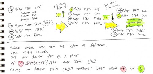
As with all of the things I design these days, I didn’t start with code when I set out to build this navigation. I started with sketching, which helped me better grasp the behavioral requirements of such a navigation scheme.

collapsing-nav-sketches

Sketching helped me realize one core problem that needed to be solved, that the first item in the list needed to be expanded by default. Indeed, there’s no reason that all navigation items should start out closed, as that’s lazy and inane. Second, this offers an affordance to the user, suggesting the behavior that can be expected from the other navigation items.

So that’s that. Visit the demo page to see the hotness stylized, or check out the basic code that makes the magic happen.

OCD Backups for the ADHD

The other day my friend Jake inquired as to what my backup configuration looks like, as he wants to do a better job protecting his data. After replying I realized that other people might benefit from the same knowledge, and so I whipped something together for ya’ll.

By no means do I claim to be a data-retention expert, as this is simply the setup I’ve cobbled together over the years. For an individual I believe it works quite well, and while there is certainly room for improvement, this should be enough to get you pointed in the right direction. If you currently have no backup system in place, and if you value your data at all, please, for the love of god, do something.

Introducing the Grizzled Participants

I currently have a Dual 2.3 GHz PowerPC G5 Tower with a 250GB hard drive, and a 1.4 GHz PowerBook G4 with an 80GB hard drive. The PowerPC is named BitterRoot, the PowerBook is named NeverSummer, and they’ve both been running Leopard since November. Indeed, these computers are starting to get a bit long in the tooth, NeverSummer especially, but these are the tools I have at my disposal. In the next few months I will roll them both into a new laptop, but I won’t be doing that until Apple launches the MacBook Pro in its new “Air-esque” form factor. It’s only a matter of time.

chronosync

Between these two computers, I use Chronosync to synchronize much of the data in my User folder, including my Yojimbo database, Things database, Address Book, and personal files and documents. I actually keep my documents outside of the Documents folder, which is largely (and ironically) unusable for managing one’s own documents, as third-party software companies have developed a penchant for shitting it full of their own worthless files. Fortunately this antagonistic behavior is only expressed by the smallest of Mac software companies, like HP, Microsoft and Adobe.

To summarize one of the takeaways from the 90-minute “Best of Both Worlds” introduction to Cocoa development: “Don’t shit in the Documents folder.” Unless you, like, actually want to suck.

Anyway, details of my synchronization setup are wont to bore even the most devoted reader, and I simply want to let you aware that, for the most part, both of my computers are backups of one another. Which is reassuring.

But not reassuring enough.

It’s all gotta go somewhere. Somehow.

timemachine

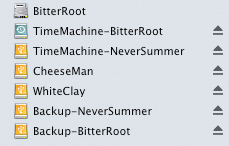
I have two external USB 2.0 drives, which spin a Seagate 7200RPM 500GB SATA drive, and a Western Digital 7200RPM 640GB SATA drive. The 500GB drive is broken into three partitions, one for the Time Machine backup of my PowerMac, another for the Time Machine backup of my PowerBook, and the last partition for other miscellaneous backups.  I know you can use a single partition to hold Time Machine backups for more than one computer, but I didn’t know that at the time I setup the drive. Plus, I didn’t want the two backups to need to fuss around each other with regards to free space.

superduper

The 640GB drive has three partitions as well, the first two of which are complete, bootable backups of both my computers. I manage the creation of these images through SuperDuper, which works like awesome. I have no hesitation in maintaining backups through both Time Machine and SuperDuper. Time Machine offers a versioned history of my computer for quickly recovering lost files or folders, and SuperDuper creates an external bootable backup that I can use for recovering from a catastrophic failure.

To the Remainders go the Odd Names

The remaining partitions on each drive, which I haven’t yet discussed in detail, are named CheeseMan and WhiteClay. These partitions hold miscellaneous files that fall into one of two categories: files that are backed up elsewhere, and files that are not backed up elsewhere. The first category includes things like my Aperture vaults, a copy of my client projects directory, and tarballs of all my websites (which also live in Subversion repositories at Beanstalk). These files all exist on another computer in some way, shape or form, and some of them (like my Aperture projects and my iTunes library) are already backed up in both Time Machine and SuperDuper. However, disk space is hella cheap, and with nearly 1.5 terabytes of it at my immediate disposal, I can afford to be excessive.

The second category of files, however, demands a bit more attention. These are files, such as raw video footage or print-quality scans, that take up so much disk space but are so rarely used, that it doesn’t make sense to have them squatting on any particular computer’s hard drive. Space can be tight on a single internal boot drive, especially on that 80GB PowerBook, and I prefer to keep things as reasonably lean as possible. Nothing sucks more than trying to download 12GB of HD video from a camera, only to watch it crap out at 80% because you only had 10GB free. It especially sucks when it happens in the field and you are without recourse. Thus, I am happiest when my boot drive has at least 40% of its space remaining.

Since these files don’t exist anywhere else I could potentially lose them all should one of these external hard drives fail. I mitigate this risk by regularly synchronizing these files between both CheeseMan and WhiteClay, so I am protected should one of those drives suddenly bite it. It was similar reasoning that led me to store my Time Machine backups on one drive, and my SuperDuper backups on the other. That way, should one drive fail I have only lost one “kind” of backup for both machines, rather than all the backups for a particular machine.

Piecing Together your own Redundant Kingdom

When it comes to an external hard drive, my experience has been that it’s not worth skimping on quality. Especially if you’re used to those high-caliber Apple products, it’s worth spending the extra dime and getting a really good external drive (or external enclosure, if you choose to build your own). Years back I went cheap on my external SATA enclosures, and I am stuck with these chintzy aluminum things that don’t have FireWire, and only support USB 2.0 and eSATA.  Indeed, should a hard drive fail in one of my PowerPC computers I won’t be able to boot off these external drives, and will need to physically install the backup drive in the system, or initially boot off the OS X CD.  That said, Intel-based Macs support booting from USB, so if you’re better off than I, you do have the option to go cheap.

You may be thinking, as I did, how a manufacturer could possibly go wrong when building an external enclosure. After all, it’s nothing but a plug and a case, right? If you go cheap, brace yourself for design flaws that you would not have considered, like a sheet metal case so thin and flexible that you can barely get it screwed back together again, or loose power connectors on the back of the enclosure. I have experience working with power cables so heavy, their girth alone is enough to pull themselves out of the back of an external drive. File this one under first-world problems for sure, but seriously, how do you fuck up a power cord?

mercury

What I recommend to you, and what I would get myself if I could do it all over again, would be the OWC Mercury Elite-AL Pro. While I don’t have the OWC enclosures myself, I do covet the ones we use at work, and they come highly recommended from our Mac consultant. You can get them either as a complete drive or as an enclosure where you can throw in your own hard drive.

You don’t save a whole lot of money if you just buy the enclosure, but ever since my PC days I’ve always enjoyed piecing together my own stuff, and the ability to simply toss in a larger drive as they become more affordable is definitely a plus. If you choose to build your own, I recommend you use either Seagate or Western Digital hard drives. Perhaps it’s superstition, but I’ve been building computers since 1996 and these guys have always worked well for me, so I largely ignore the competition. I have a similar attitude towards RAM from Crucial and Micron. Any other manufacturer is dead to me.

Knowing is Half the Battle

So that there’s my backups. To recap, I keep two external drives, one with Time Machine backups for lightweight file recovery, and another with bootable SuperDuper backups for heavy-duty system restores. In addition, one of the drives holds redundant backups of miscellaneous files (my iTunes library, Aperture vaults, etc.), and both drives maintain mirrored storage of files that are large and valuable, but rarely needed.  Maybe it’s overkill, but with 500GB drives under $80 and shoddy-but-sufficient enclosures under $30, there’s really no excuse.

Looking to the future, the biggest chink in my armor right now is my lack of offsite backups. There are a number of ways to address this, one of which includes using SoftRAID to setup a RAID-1 mirror between three drives. The primary drive in the RAID should be your main external backup drive, containing all your bootable backups, which in turn would be plugged into two secondary drives, one of which would be cycled offsite at all times.

This approach is awesome, but it’s pretty industrial-strength. What I will probably do pretty soon here is get a third backup drive, whose configuration would resemble my SuperDuper drive and its supplementary files, run backups to it every couple weeks, and store it offsite in a secure, undisclosed location.

Hopefully I’ll have my new MacBook Pro Air Tablet Nano Phone Extreme by then.

Deterrent

Buried deep in our chests, each Hood River citizen is now required to wear an economic growth inhibitor at all times. The weather-changing device atop City Hall is now operating at full power, effectively deflecting all tourists and their valuable Canadian dollars away from our town.

We’ve started referring to this month as June-uary, and at this point we’re beginning to lose all hope for the summer. It’s 50 degrees and cloudy here, and if this miserable weather pattern keeps up much longer there’s risk that we’ll all go back into our off-season hibernation. Frigid conditions aside, I’ve still gotten in a ton of kiteboarding this season, and last week I rode my custom 5’3″ North Pacific in some of the biggest, glassiest swell I have ever seen at the White Salmon Bridge.

Meanwhile, I’ve been reading the new Aaron Hillegass book and trying to teach myself Objective-C and Cocoa. The book is wonderful, but every time I try to improve my programming skills I feel like a dog trying to walk on its hind legs. My knowledge of Ruby and other object-oriented languages definitely helps with the learning curve for Objective-C, and my familiarity with a few different MVC frameworks, including Rails and CodeIgniter, helps with the underlying concepts of Cocoa. I recently spent an inordinate amount of time researching event listeners and how they’re manifested in JavaScript, and as a result my crude understanding of event-driven programming is nonetheless sophisticated enough that I can recognize it in unfamiliar territory.

This ability to abstract knowledge from the specific to the general is what separates man from the lichens and mosses of the world, and I take pride in that fact. Even so, I always feel clumsy and awkward as I stumble blindly through a new language or a new programming concept. I can’t shake the feeling that I’m making this harder than it is, that these are ideas I would have learned the first semester of my freshman year, in an Intro to Computer Science course.

That said, my education wasn’t in computer science. It wasn’t then, it isn’t now, and it won’t be in September. My areas of study included music, jazz, writing, English, philosophy and journalism. And yet I keep inexplicably gravitating towards programming, perhaps because I enjoy learning, perhaps because I’m a glutton for punishment, and perhaps because I have this awful habit of seeking out and doing the things that I find most frightening and difficult.

Ergo Oregon, ergo kiteboarding, ergo interaction design.