Category Archives: Typography

Going Indie

It’s barely December, but I’m so sick and tired of this semester that I’m already working on next year. Kate was nice enough to get me Phaeton as an early Christmas present, and so I’ve been working on the art direction for my independent study next year:

The Hans and Umbach Electromechanical Computing Company

This is gonna be a fun one.

Zoom, Zoom, Zoom

I started using Safari 4.0 yesterday, and I like what I see so far. The new Javascript interpreter is fast. The controls for Google Maps are so quick they’re frightening. Just try using your scroll wheel (or two-finger gesture on the trackpad of your new non-removable-battery MacBook Pro) to zoom in. If there’s a faster way to reach the surface of the earth from space, I’m sure Burt Rutan is working on it.

Err, the opposite, I’m sure he’s working on the opposite. Sheesh.

Anyway, I will leave you with the coolest, blockiest typeface I have ever seen in my life. Seriously, check out these titles:

Golden Gate Bridge Plaque

Beautiful. Let’s get a little closer, shall we?

PAST OFFICERS, PAST DIRECTORS

And once more, for the people in the balcony:

DIRECTORS detail

Man.

Every man has his limits.

My grandiose plans for the day were aborted this morning when I locked myself out of the house. Our flat is on the third floor so squeezing through a window was out of the question, and after hopping our 15-foot gate and squeezing through its greedy wrought iron spikes I discovered that yes, the back door was locked as well. I took the BART into downtown so I could grab my roommate’s keys, and by the time I had sorted myself out of my little predicament it was too late to leave on my prescribed bike ride.

Oh well.

This evening I went to Adaptive Path to learn about Mobile Literacy, a research and design project where they traveled to rural India to understand how illiterate users interact with mobile technology. It’s a fascinating project, with strong currents of cultural sensitivity, social justice, and the role that empathy should play in design. Their blog continues to reveal further details regarding Mobile Literacy, so it’s worth a look if you’re into this sort of thing.

What’s super cool is that Adaptive Path has released all of their primary research under a Creative Commons license. Research findings, interview videos and transcripts, the whole shebang is open for you to study and pick apart, firsthand.

Their process culminated in two proposed devices. One is the MobilGlyph concept, which aims to make data tangible by sharing it through two-dimensional bar codes, similar to Cheng Fan’s wayshowing work last semester. The other is the Steampunk concept, which aims to make the functions of the phone as physical as possible, granting them affordances that invite dismantling and tinkering.

Finally, it’s been nearly five years but it still rings true today. Jeffrey Veen is still larger in life than he is in legend. We are lucky that he is such a kind and gentle soul, because he could very well crush every last one of us. Fortunately, instead of scheming how easily he could mash humanity into a fine paste, he directs his energies into building amazing things like Typekit, which stands to revolutionize how you use typefaces (or “fonts”, for those of you who aren’t an insufferable snob like myself) on the web.

Yes, Jeff is a benevolent giant, but I am a man of small stature and predictable bitterness. Thus I will use these newly found typographical powers only for evil, blanketing the landscape with cruel renderings of Papyrus, Hobo and Copperplate.

But not Comic Sans. No one would dare go that far.

Rounding the Corner

Today was one of the best days I’ve had in months, and I don’t think it can be entirely attributed to my massive caffeine intake.

I spent my entire morning grading assignments, drinking yerba maté, and watching small birds dine at our feeder. We are most frequented by house finches, and at one point we had six of them fluttering about on our deck. The chickadees are rather entertaining, how they grasp sunflower seeds between their feet and noisily peck them open. This morning we were even paid a visit by a male red bellied woodpecker, who was quite enormous considering our bird feeder is no larger than a cigar box.

My love for these birds isn’t universal, however. I hate the sparrows, or as I call them, hobo finches.

As most great stories often end, eventually I had to go to school. Today we were sharing and critiquing proofs for our final typography project, and my “Western U.S. ruggedness meets European luxury via turn-of-the-century railway hotels” concept for an Akzidenz-Grotesk specimen book went over well. I got a lot of really good feedback from my classmates, too, and I’m excited to continue refining my work.

After hearing everyone share horror stories about color printing and registration and all that “recto-verso” jazz, however, I must say I’m a tad apprehensive about this whole “physical materiality” thing. I definitely want to move beyond the intangible nature of digital work, but the hardships of producing a double-sided color print sound akin to sailing the Cape Horn, and leave me wondering how the heck I’m going to pull this thing off. I don’t know what kind (or even size, for that matter) of paper I’m going to use, and I certainly don’t know how I’m going to slap ink on it… let alone more than one color of ink. And sheesh, more than one side? Maybe Kinko’s will save my ass.

However, last night I did put together a couple of book binding prototypes, properly armed with a stapler, stylish paper, this week’s 20%-off coupon from Bed Bath & Beyond, and Super 77:
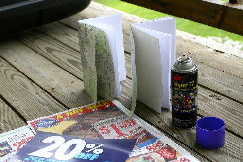
img_8438

And folks, Super 77 needs to be inducted into the Periodic Table of Awesomements, like, yesterday.

But seriously, I almost shed a tear today when our final typography class came to a close. I’ve learned so much in that class, from history to composition to gestalt to kerning to grids to the innumerable parallels between graphic and interaction design, that it’s hard to believe it’s only been four months since we started. Sheesh, I got to work with printing presses, real mechanical printing presses with heavy gears that will pinch your fingers, and rollers that will tear the hair right off your head. Risking life and limb? that’s what we call design, baby.
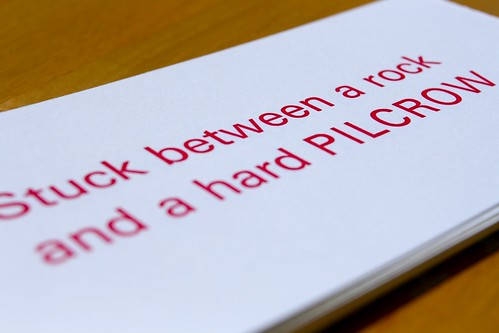
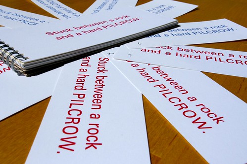
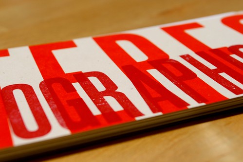
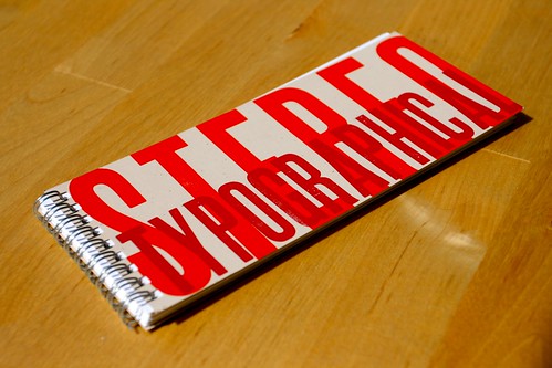
Type Cliché Letterpress Project

Type Cliché Letterpress Project

Type Cliché Letterpress Project

Type Cliché Letterpress Project

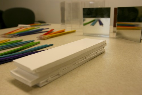
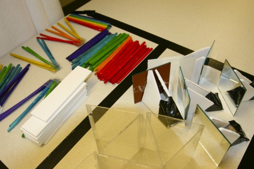
The day wrapped up with an evening meeting with my experience design team. We’re in the process of prototyping a museum installation where people learn about light by playing with mirrors and prisms.
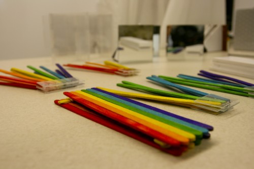
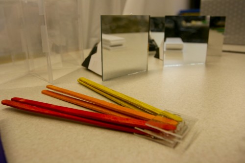
img_8424

img_8425

img_8426

img_8435

There are some particularly subtle experiences we’re trying to recreate, not the least of which involve producing an immersive environment that suspends time and encourages focused, exploratory behavior. Our installation is designed to be fun, but we’ve described ours as a kind of “PBS fun” rather than “Nickelodeon fun.” Further, we’re introducing a social aspect that allows others to indirectly engage with (or contribute to) the experience, which will involve a separate prototype that we hope to build this weekend.

With flashlights. And Saran Wrap. And Sharpies, toilet paper tubes, duct tape, an iPod on repeat, and a dark, dark room. As our professor so lovingly told us the other day, “You guys are poor graduate students. You’ll build prototypes out of whatever garbage you can get your hands on.”

And so we did. And so we will.

Wood Type for All

Ever since I became aware of its existence, I have wanted to visit the Hamilton Wood Type Museum in Two Rivers. Until then I will have to be satisfied with drooling over the Unicorn Graphics Online Wood Type Museum, which features a digital cornucopia of specimens from a bygone era.

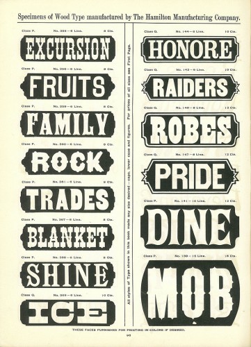
The centerpiece of their online collection is definitely the Hamilton Wood Type Catalog #14, which they have lovingly scanned in its entirety. Hoefler & Frere-Jones have already waxed poetic about this collection. If a gorgeous page like this doesn’t make you freak out just a little, you might be running in the wrong crowd. Foils dude, look at them foils:

Hamilton Wood Type