<3 Adaptive Path

Ten years ago I asked my manager if we could go on a walk. I was working as a front-end developer for a tiny web development shop in Bend, Oregon. I was young, talented, and a bit of a shit.

My manager sensed something was up, so instead of a walk he recommended we go to the bar. Over a couple of pours of Deschutes’ finest I told him that in three months I was going to leave the company to go work as a wilderness guide in northern Minnesota.

I didn’t know how he would take it, but my manager, a dear friend and mentor to this day, slapped me on the back, said “Fuck yeah, man!” and bought us a second round. He spent his twenties gallivanting around and guiding rafting trips, you see, and he wanted the same for me.

I was angry and burned out on web development. It was the dawn of the standards-based web design movement, and I had spent the last year slicing and dicing visual design comps into HTML and CSS. Some of them were gorgeous templates produced by talented print designers, but after I painstakingly turned them into sites they would sit forlorn on the web for months, empty of content. Our team was hard at work building a content management system our clients never used, to power websites their customers never visited.

We had all-company meetings every Friday, where I would often drink a Sparks and yell at the founders that they were doing everything wrong. I had no answers to our problems, only strongly held beliefs, which is what you do when you’re in your twenties.

It was 2004. Blogging was the rage and I kept up with all the heavyweight web designers of the day, Jeffrey Zeldman, Jason Santa Maria, Dave Shea and Doug Bowman, to name a few. This was pre-Twitter, and most people had little link lists or sidebars or whatever on their blogs where they shared hyperlinks to interesting things going on in and around the interwebs. Micro-blogging, before that was a thing.

That fall, I noticed that people kept posting about an upcoming two-day design workshop hosted by a little design company in San Francisco. I kept it in my periphery, but in the days leading up to the workshop the mentions got more and more hysterical. The week before the workshop I crossed my fingers and emailed my manager, asking if I could skip out a few days next week and travel to San Francisco.

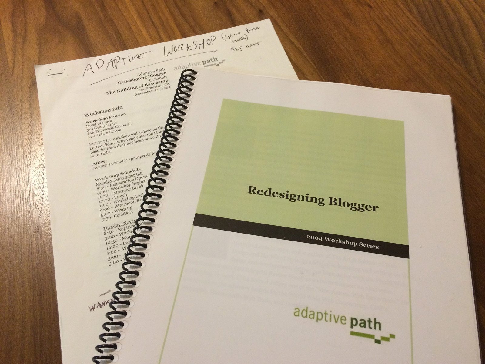
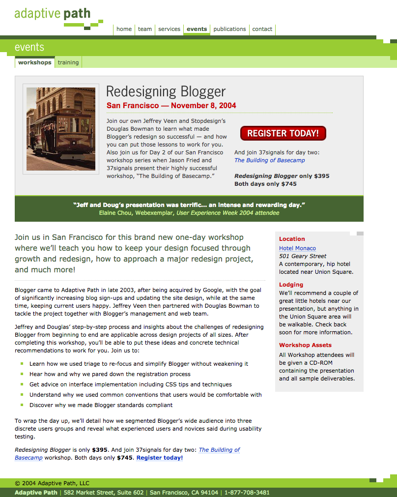
Screenshot of Adaptive Path's 2004 San Francisco Workshop

(Let’s be honest… the whole reason I did any of this was because of a picture of a trolley)

He didn’t owe me anything. I had told him weeks before that I would leave the company in January.

Miraculously and fatefully, he said yes.

He gave me the time off for the trip, but said I would have to foot the bill myself. Not a problem. I was ecstatic. It was more than a fair trade.

I plotted a route in MapQuest, filled up the Subaru, and after work on Friday aimed south and started my journey from Bend to San Francisco. I hit Weed in the spooky dark. Near Castle Crags I pulled off the road and slept in the back of my car.

Morning, Castle Crags

I awoke to low clouds settled in the pines, and oaks yellowing with the season. I wound down through the mountains back to the freeway, and inched closer to the Bay Area. Later, while crossing the Carquinez Bridge into East Bay, I remember keeping up with traffic at eighty miles per hour as sports cars weaved through us as though we were standing still. I spent the night at a Holiday Inn Express in San Pablo for $60.

The next day I set out to find the “Ashley” BART station (as I wrote it in my notes) but got lost instead and ended up in a six-lane traffic jam. I stumbled blindly through Berkeley until I found my quarry, and hopped BART into San Francisco. I transferred at MacArthur and our train broke down at Embarcadero. For a child of the Minneapolis suburbs the entire experience was like traveling in a foreign country, and if you had told me that in six years I would be living here I would have told you you were nuts. If you told me I would move here to work at Adaptive Path, I would have told you you were insane.

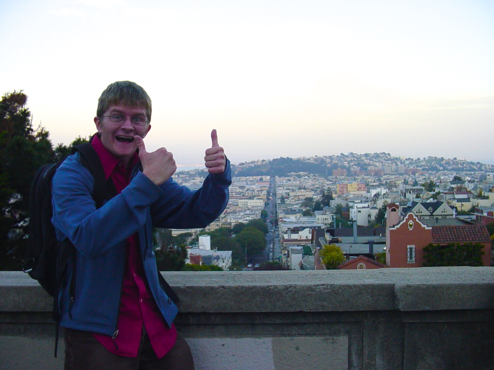
DSC03319

I found my way to Union Square and a kind homeless fellow named Benny helped me find my hotel, the Kensington Park. I checked into my room, gorgeous and a steal at $119 a night, and then met up with one of my freelance clients. We had lunch at the Cheesecake Factory. We ate out on the balcony. A pigeon shit all over him.

The two-day Adaptive Path workshop kicked off the next morning at the Hotel Monaco. It was November 8, 2004, exactly ten years ago today.

IMG_2656

(If you’re into historical artifacts, you can download the slides from the Blogger redesign workshop or grab a zip file of all the materials they shared with us that day)

The entire Adaptive Path crew was super nice and welcoming. Doug Bowman and Jeff Veen shared the story of their Blogger redesign project, which promptly blew my mind. I had long suspected that there was a better way to design and build things for the web, but I had never heard of “user experience” before. In short order Jeff taught us about ethnographic research, personas, task flows, usage metrics and usability testing, among other things, and Doug revealed the magic behind the HTML and CSS that brought his designs to life.

I was elated. Here were my people. Matt Mullenweg was there in the audience, the author of a little tool called WordPress that some people used instead of Movable Type and Greymatter to author their blogs. We all walked down to Tad’s Steakhouse He had just moved to San Francisco. Like, that weekend.

It was a pivotal time for many of us.

In a matter of hours, I had gone from wanting to move to the woods and give up on the web entirely to being one of the most passionate UX converts ever. I learned that it wasn’t just me who was dissatisfied with the status quo of development-focused product design, followed by a thin film of superficial visual design. In fact, there was a whole practice dedicated to the belief that the best way to build great websites and software for people was to empathize with them, deeply understand their needs, and craft a product that addresses them at a fundamental level. I can’t emphasize enough how much this discovery revolutionized my worldview.

Doug and Jeff’s workshop was a truly life-changing experience for me, and it happened all again the following day, when the guys from 37signals got up and talked about building Basecamp. DHH demoed Ruby on Rails, building a to-do list application right there before our eyes. I was positively drunk on inspiration, on the infinite abilities of humankind to do smart things and build kind experiences for each other.

This, this is what I knew I wanted to do with myself, and I owed it all to two days with Adaptive Path.

DSC03333

(So young. So obviously in love with 20th Street)

The workshop wrapped. I took the Muni to Dolores Park, and caught up with a music friend who was living in San Francisco. Her friend was wearing a backpack with a seatbelt, which seemed kind of weird at the time. I hauled my ass back to East Bay, grabbed my Subaru from “Ashley” BART, and aimed north.

I slept in my car again at Castle Crags.

And arrived home in Bend the following day.

Everything was still the same, but somehow, different.

So thank you, Adaptive Path, for all of that.
My hypothetical talk for design students, based on a few years working at one of the best UX studios in the world.

The other day I got an email from Erik Stolterman, which got me thinking how nice it would be to get back to Bloomington one of these days and check in on the HCI/d program. With life and work and all the trip probably won’t happen soon, but our correspondence made me reflect on the talk I would like to give to current design students, based on what I’ve learned in my last few years in the industry.

I don’t have time to prepare this talk, let alone give it, but I feel if I did it would go something like this.

An introduction.

For the last 2 1/2 years I’ve been working as an experience designer at Adaptive Path, one of the top UX studios in the world. Every day we go toe-to-toe with IDEO, frog design, Hot Studio and other big wigs in our bids for new project work. I have good friends at each and every one of these studios, and more besides. We all do excellent work. Sometimes Adaptive Path lands one of these projects and I get to work on it, and other times my friends do. That’s just the way of the world.

I am a consultant. I work at a consultancy. That means companies come to me because they’re scared shitless about something and want me, a so-called design expert, to help them find the right path forward. Sometimes it’s finding the Buddha nature of a product. Other times it’s crafting and communicating a strategy for a product that does not yet exist.

Always, it is the pursuit of articulating and bringing to life the ideal experience of a product. Frequently that product is actually a multi-channel service that touches myriad users, customers, departments and stakeholders.

Always, I am working with clients.

Over the last couple years I’ve learned a lot of things. It’s been a painful experience, as is any true personal growth. I would like to share what I’ve learned with you, dear students, so when you go out and walk the path I have walked, you might have some idea of what to expect.

I sure thought I did. And I sure as hell was dead wrong.

This job is 20 percent how great you are at design, and 80 percent how great you are at working with people.

Being a great designer can give you a hell of a good head start, but if you can’t work with other designers, if you’re not good at interacting with clients and stakeholders, if you can’t show respect for operational, political and business constraints, you will always be limited in how much impact your designs will have on an organization.

Communication is absolutely key.

If you can share your ideas clearly, concisely and effectively, you will do well. If you cannot do this, you will need to work on it. Trust me. You will need to work on it. This goes for communicating with clients, as well as project managers and your fellow designers.

When someone is talking, they’re telling you something that’s important to them.

There’s the words that are said, but there’s also the motivation behind the words that are said. Your job is not just to hear and respond to the words, but understand why they’re saying those words, and speak to that. You know that empathy we are really good at extending to our end users? You need to apply those same principles to the people you work with, other designers and clients alike.

In the end, your client needs to be the strongest advocate for your design.

When you’re a consultant working with a client, there will come a time when your engagement ends and you move onto the next project. Your client, meanwhile, will continue to own your work in your absence, advocating for it within their organization, shepherding it through development into launch, and continuing to maintain and iterate on it.

Your job isn’t to be the genius. Your job is to get the best design possible out into the world, where it can affect people and bring about real change. This applies whether you’re designing an actual digital product or articulating a five-year organizational multi-channel strategy. The most powerful force for making this happen isn’t your skill as a designer, but the sheer will of your client, their belief in your design, and their desire to see it realized.

Ultimately, your design lives and dies with your client. The more you can involve them in your process, the more you can instill in them a sense of ownership, the better the chances of your design making it through the organizational gauntlet. If you can transform your client into an advocate for your design, they will move mountains to see that it happens.

You are always selling your design.

Your design work isn’t done until you’ve sold it through to the client. The word “sell” gets a bad rap. I don’t mean “sell” in a sleazy used car salesman kind of way. I mean “sell” in that you are authentically communicating the value of your design in a manner that resonates with your audience.

Pace yourself. It isn’t done when you’ve posted the deliverables, but only after you’ve walked through the deliverables, and you’ve gotten all the heads in the room nodding.

No one but you is going to sell your design work.

Again, this job is 20 percent design, 80 percent selling design. Whereby “selling” I mean “getting people to rally behind the idea you want to be realized.” Notice how I didn’t say your idea or your design. As much as possible as a design consultant, you need to pass the title of ownership to your client. Not necessarily intellectual or creative ownership, but gut ownership.

Always anticipate the next step.

Let’s say you present your design work to a C-level executive team. It goes better than you ever could have expected. They love it. They want to build it. Which part of it, you might ask? All of it. (trust me, this can happen).

For the longest time, I was under the impression that if my design work is good enough, if I communicate it well enough, that someone better and smarter than me would take it over and shepherd it into existence. The terrifying and exciting thing is, this does not happen.

What’s next?

You need to have a clear answer to this question. You’ve been living and breathing your project for so long that you are the authority on it. Any great leader at any organization is going to realize this, and you know what? They’re going to ask you what needs to happen next in order for your project to move forward.

In conclusion.

My talk would have an awesome conclusion where my last slide would say “And one more thing…” and I would walk over to a coat rack with a sheet over it that was on stage with me the entire time and I would pull off the sheet and wouldn’t you know it’s not a coat rack at all but AUSTIN CLEON HIMSELF and so my conclusion would be Austin giving his awesome talk How To Steal Like An Artist from UX Week 2012.

Does that sound good?

On Consulting

For two and a half years, now, I’ve been working as a design consultant. It wasn’t until the last year, however, that it’s begun to sink in for me what that actually means.

Let’s get one thing straight. Design is extremely important in my work. Every day I’m bustin’ hump in the tool du jour, whether it’s Keynote or Illustrator or Excel at my desk, Sharpies and Post-Its and half-sheets of paper in the project room, a red pen and 11×17 print-outs in a design critique, pen and paper when out in the field doing in-home interviews, or donning my coding mask and cranking out a prototype for user testing or front-end code for production or what have you.

I am a specialized generalist. I need to be insanely great at all of these design activities. And the new activities we invent on-the-fly to fit the needs of the project? I need to be great at those as well.

But.

I have found that while being a designer is extremely important in being a design consultant, being a good listener and communicator is even more important. Like, we’re talking 80/20 here. All Pareto Principle up in here. And that’s not 80 percent design, but eighty percent communication.

The biggest reason great designs never see the light of day is due to a lack of organizational will. And deeply understanding that will, and bending it to our purposes, is perhaps the most important thing a design consultant can bring to the table.

Good designs don’t die because they’re not great. They die for the same reason as great designs.

If you want to be a successful design consultant, you need to understand your design medium. And that medium is not web, not mobile, not digital, not print or multi-channel or built space or whatever.

Your medium is people.

But it’s not the people you think it is.

Because your probably thinking of your users. Or customers. Or whatever we’re supposed to call them these days.

No doubt, understanding your users and their behaviors, their emotions, their hopes and dreams and fears, is unbelievably important. But as a consultant, nothing you dream up is going to get remotely close to them if you can’t win over the hearts and minds of your client.

It took me far too long to realize this, but we’re not hired in order for us to do awesome design work. It’s certainly nice that we do, and people tend to be very happy when it works out that way, but it turns out it’s not about you or your designs. It’s about your client and their users.

Every day you are interacting with the client, you need to be selling your design. Not at a superficial level, not at a used car salesman level, but at a deep and empathetic level.

You know all that effort you take to understand and empathize with your users so you can design great things for them? You need to apply that same level of empathy to your stakeholders and clients.

When was the last time you proposed a particular approach to a design challenge that you felt was fundamentally in the best interest of the user? And when was the last time someone on your client team hesitated in accepting that idea, based on their knowledge of business constraints, market constraints, technical constraints, or whatever?

How did you respond? Did you carefully articulate your rationale for the idea? Did you lock horns and argue? Did you storm out in a huff? Did you agree to redesign it the way they asked while grumbling to yourself about how stupid an idea it was and how much it compromised the rest of the system? Or did you ask them why they feel that way, and try to arrive at some sort of mutual understanding?

Whenever someone is talking, they’re telling you about something that’s important to them. There are the words that are said, but there are far, far more words that are not said. Your job as a design consultant is to get to what people mean by what they’re saying, whether they’re users or clients.

Also, clients don’t hire you because you’re a hot shot designer with a reputation. They hire you because they have a job that needs done, and they think you’re the right one to do it. They’ve put a lot on the line, probably spent a considerable amount of their budget, to bring you into their game, and so you owe it to them to listen to them.

Your job isn’t to take a brief, go down a hole, and eight weeks later simply wow your clients with your work. That’s execution, not design, and the “wow” factor rarely lasts more than a few minutes after the big reveal anyway.

Nay, your job is to work closely with your client at every step of the way to make sure you’re aligned strategically, and yes, politically. Your client needs to be able to own your work, heart and soul, and evangelize it within their organization. They’re the ones who put their ass on the line to hire you, and this should be their victory.

A design that meets the needs of users without meeting the needs of the business and thus doesn’t get implemented, is a failed design. A design that meets the needs of both users and the business, but hasn’t been co-created or communicated in such a way that key stakeholders are sold on the idea, is likewise at huge risk of failure.

But what of the design that was brilliant, satisfying every aspect of feasibility, viability and desirability, but over time was chipped away and compromised at the request of a nervous client until it was unrecognizable? Who is responsible for the resulting mess, the client, or the designer acting under the client’s direction?

These are the good fights, the important fights to have, and they seem to have little to do with design skills, and everything to do with people skills. An effective design consultant is able to carefully listen to, understand and empathize with a client, alleviating their anxieties while simultaneously standing up for the design. Even after the design is finished, the majority of the work still remains. Design is a job, and you’re not done until you’ve sold your design through.

A great design consultant knows when to be the oak and when to be the reed, in a storm bearing little resemblance to what we might consider a design practice.

But this is life.

Introducing Another Website For You To Check On A Regular Basis In Addition To Twitter And Flickr And Kate’s Blog

It’s called thegreatsunra.com.

From 2001 to 2006 I maintained a weblog on a fairly regular basis. In those early years it was new and exciting to be “publishing” to the “internet” to “people” who may or may not be there; who you may or may not even know.

I started losing steam in 2005. My online publishing became downright anemic by 2006. For the last four years, my online identity has been wildly fragmented, publishing across the Twitters and Flickrs and Facebooks (for a spell) and Vimeos and Brainside Outs and Daneomatics and Tumblrs and even some super-secret projects that you don’t even know about, which I started and ended quietly in an attempt to rekindle that original flame.

For four years I feel I have expended far more energy trying to pull these disparate identities together into some cohesive whole, than I have actually contributing to the ether. You know, writing. Or publishing. Or making. The whole reason I started down this path in the first place. The technology was never meant to be an end, the packaging never the focus, but merely the mechanism by which I communicate with the world, externally processing my thoughts while simultaneously getting them out there in the world.

As such, I’m trying something new. Perhaps this too will fail, but I prefer to let time be the judge of that.

In 2001 my original website, by the ostentatious name of “Cromlech”, was built in Adobe GoLive. Then, it was built in Dreamweaver. Then in Notepad for a spell. Then Greymatter, if any of you whipper-snappers remember that (I’m pretty sure Zosia Blue does).

Greymatter was instrumental to supporting my blogging efforts during the summer of 2002, when I worked at Camp Ihduhapi. It was the first time I could update my website from any computer whatsoever, without needing to FTP into the server.

It was also the reason I learned HTML.

Cromlech became “Dane’s Bored” which became “Brainside Out” which I eventually migrated to Movable Type. Upon Movable Type it remained until 2006, when I launched Daneomatic on WordPress. The weblog portion of Brainside Out, complete with archives from 2001 to 2006, is still available on the internet at siskiwit.brainsideout.com, where it remains in stasis.

And so, I wish to introduce thegreatsunra.com, a Tumblr blog which may (or may not) support my contributions to the intertubes. This space is getting hella-crowded and writing for the web isn’t nearly as much fun as it was once before, but I do still have “ideas” that I need to get “out” so that I can continue having “more” ideas.

So, for the five of you who read this, you now have another place you need to check in order to keep tabs on me. And for that, I apologize. I fully realize it’s poor user experience, and I can only hope it is forgivable.

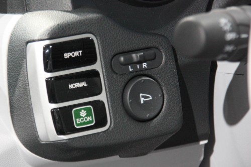
The Honda Fit EV concept car has a high heels button!

In other news, I cannot recommend the WordPress iPad app.

More often than not, my day resembles a modern art exhibit.

Someone applied a taxonomy to the sandwich.

The fellow in the turkey hat was not amused.

The lifeguard gave me a weird look, before dancing off in a jig.

The crazed man sat in the middle of the sidewalk, glowering at the legal pad still in its packaging.

The man in the sleeping bag shouted at himself, as the can of Budweiser rolled lazily back and forth.

Kinect = DIY 3D Video Camera

This absolutely blew my mind-grapes:

Splitting Subversion into Multiple Git Repositories

For the last three years I’ve been maintaining all my projects and websites, including Daneomatic and Brainside Out, as well as I’ve Been To Duluth and Terra and Rosco and Siskiwit, in a single Subversion repository. At any given time I find myself tinkering with a number of different projects, and honestly it keeps me awake at night if I’m not tracking that work in some form of version control. Given the number of projects I work on, and my tendency to abandon them and start new ones, I didn’t feel it necessary to maintain a separate repository for each individual project.

Subversion is, frankly, kind of a stupid versioning system, which actually works to the favor of someone wanting to manage multiple projects in a single repository. Since it’s easy to checkout individual folders, rather than the entire repository itself, all you need to do is create a unique folder for each individual project. Unlike Git, the trunk, tag and branches are just folders in Subversion, so you can easily compartmentalize projects using a folder hierarchy.

This approach creates a terribly twisted and intertwined history of commits, with each project wrapped around the other. My goal, however, was not necessarily good version control, but any version control at all. Like living, keeping multiple projects in the same repo beats the alternative.

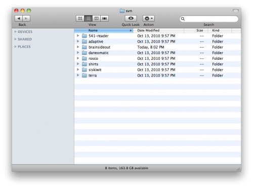
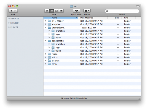
The folder hierarchy of my Subversion repository looks like this. Each project has its own folder:

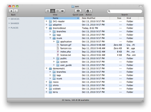
Within each project is the standard folder structure for branches, tags and trunk:

In the trunk folder is the file structure of the project itself. Here’s the trunk for one of my CodeIgniter projects:

While it’s generally bad practice to keep multiple projects in the same repository in Subversion, near as I can tell it’s truly a recipe for disaster in Git. Git is real smart about a lot of things, including tagging and branching and fundamentally offering a distributed version control system (read: a local copy of your entire revision history), but that smartness will make your brain ache if you try to independently maintain multiple projects in the same repository on your local machine.

And so it came to pass that I wanted to convert my single Subversion repository into eight separate Git repositories; one for each of the projects I had been tracking. There are many wonderful tutorials available for handling the generic conversion of a Subversion repo to Git, but none that outlined how to manage this split.

I hope to shed some light on this process. These instructions are heavily influenced by Paul Dowman’s excellent post on the same subject, with the extra twist of splitting a single Subversion repository into multiple Git repositories. I would highly recommend you read through his instructions as well.

First things first: Install and configure Git.

First, I installed Git. I’m on OS X, and while I’m sure you can do this on Windows, I haven’t the foggiest how you would go about it.

After installing Git I had to do some initial global configuration, setting up my name and address and such. There are other tutorials that tell you how to do that, but ultimately it’s two commands in Terminal:

[prompt]$ git config --global user.name "Your Name"
[prompt]$ git config --global user.email [email protected]

Also, I needed to setup SSH keys between my local machine and a remote server, as the ultimate goal of this undertaking was to push my Git repositories to the cloud. I have an account at Beanstalk that allows me to host multiple repositories, and they have a great tutorial on setting up SSH keys in their environment. GitHub has a helpful tutorial on SSH keys as well.

Give yourself some space.

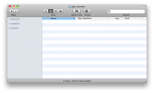
Next, I created a folder where I was going to do my business. I called it git_convert:

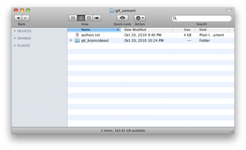
Then, I created a file in git_convert called authors.txt, which maps each user from my Subversion repository onto a full name and email address for my forthcoming Git repositories. My authors.txt file is super basic, as I’m the only dude who’s been rooting around in this repository. All it contains is this single line of text:

dane = Dane Petersen <[email protected]>

Now crank that Soulja Boy!

Now comes the good stuff. The git svn command will grab a remote Subversion repository, and convert it to a Git repository in a specified folder on my local machine. Paul Dowman’s tutorial is super handy, but it took some experimentation before I discovered that git svn works not only for an entire repository, but for its subfolders as well. All I needed to do was append the path for the corresponding project to the URL for the repository itself.

What’s awesome, too, is that if you convert a subfolder of your Subversion repository to Git, git svn will leave all the other cruft behind, and will convert only the files and commits that are relevant for that particular folder. So, if you have a 100 MB repository that you’re converting to eight Git repositories, you’re not going to end up with 800 MB worth of redundant garbage. Sick, bro!

After firing up Terminal and navigating to my git_convert directory, I used the following command to clone a subfolder of my remote Subversion repository into a new local Git repository:

[prompt]$ git svn clone http://brainsideout.svn.beanstalkapp.com/brainsideout/brainsideout --no-metadata -A authors.txt -t tags -b branches -T trunk git_brainsideout

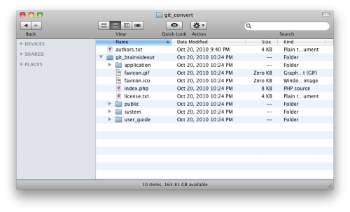
After some churning, that created a new folder called ‘git_brainsideout’ in my git_convert folder:

That folder’s contents are an exact copy of the corresponding project’s trunk folder of my remote Subversion repository:

You’ll notice that the trunk, tags and branches folders have all disappeared. That’s because my git svn command mapped them to their appropriate places within Git, and also because Git is awesomely smart in how it handles tags and branches. Dowman has some additional commands you may want to consider for cleaning up after your tags and branches, but this is all it took for me to get up and running.

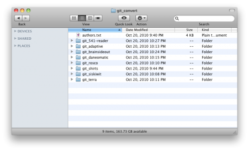
Using git svn in the above manner, I eventually converted all my Subversion projects into separate local Git repositories:

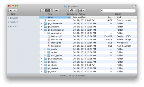
Again, the trunk, tag and branches folders are gone, mapped and replaced by the invisibly magic files of Git:

Push your efforts into the cloud.

I had a few empty remote Git repositories at Beanstalk where I wanted all my hard work to live, so my last step was pushing my local repositories up to my Git server. First, I navigated into the desired local Git repository, and setup a name for the remote repository using the remote command:

[prompt]$ git remote add beanstalk [email protected]:/brainsideout.git

I had previously setup my SSH keys, so it was easy to push my local repository to the remote location:

[prompt]$ git push beanstalk master

Bam. Dead. Done. So long, Subversion!

For more information on how to get rollin’ with Git, check out the official git/svn crash course, or Git for the lazy.

Happy Gitting!

Clean Slate

I’ve been cleaning a lot of the cruft out of my domains lately. Subdomains, development domains, MySQL databases originally setup to stage all sorts of nefarious dealings… they’ve all been pulled up by the roots and tossed into heaping piles of gzipped tarballs.

As part of this activity I’ve been cleaning out my Google Analytics account as well, as many of my analytic site profiles refer to domains long gone, testing procedures long concluded, directions I thought my web interests would go but didn’t. Having just made a Great and Terrible Mistake and irreversibly destroying a trove of information courtesy of the slop that is the Google Analytics interface, I have penned a cautionary tale to let you aware of two of its most dangerous functions: pagination and deletion.

Google Analytics Pagination: Party like it’s 1995 (and your 14.4K U.S. Robotics Sportster just arrived)

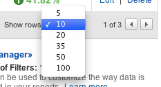
The pagination tool in Google Analytics defaults to displaying only 10 site profiles per page. Using the dropdown menu you can change this to 5, 10, 20, 35, 50 or 100.

An option to display only five profiles per page? What the hell? In what universe would that be useful? Are we seriously so pressed for bandwidth in 2010 that we cannot afford to peer at the world through more than a pinhole? Further, the cognitive load of needing to choose between six freaking options is ridiculous. It’s a modest burden to bear but oftentimes interfaces manage to kill their users not through a single fatal flaw, but through an endless series of tiny papercuts such as this.

Seriously, Google Analytics. If you must have pagination, limit the options to 10, 50 and All. And for all that is holy, remember my choice for at least the duration of my session. Needing to reset the number of rows every time I go back to my profile list is maddening, and the fact that I can’t save this option as a personal setting is driving me insane.

Or would drive me insane, if I hadn’t screwed up in a much bigger way. Pagination in Google Analytics has an additional feature whose destructive tendencies are so finely tuned that they trump even the above critique. To expand on this, we’ll take a quick stroll through the flawed workflow for deleting a site profile.

Deletion: With great power comes insufficient gravity and illustrative consequence surrounding said power.

To delete a site profile, you click the “Delete” link in its corresponding row:

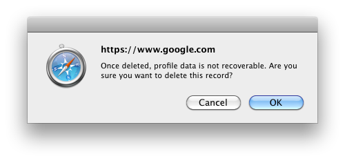
When you click “Delete” a beautiful alert box pops up, a charming implementation of the “Hello World” of any beginner’s javascript tutorial:

In the alert box, the profile that will be deleted is not mentioned by name. It is up to you to remember, guess or assume which profile you originally clicked on. The most prominent information on this alert is the domain of the website that initiated the alert. Is that really the most important thing you need to know at this point, in order to make an informed decision? More important than the fact that the profile data cannot be recovered? More important than the name of the profile that’s actually being deleted?

Also note that “OK” is selected by default, so that pressing the return key will delete the profile. With an action as destructive as the irrecoverable deletion of years worth of information, it’s insanely poor form to select this choice by default.

Perhaps if creating a sensible “Delete” workflow in Google Analytics was as precious as maximizing clickthru rates on text ads, we’d see Google employing the same obsessive levels of testing that the color of hyperlinks currently enjoy. As it stands, all I can say is user experience my ass.

One Plus One Equals Gone

The ambiguous delete tool in Google Analytics, combined with its poorly-executed pagination functionality, creates a perfect storm of destruction. No matter what page you are on, when you click “OK” to confirm the deletion of a profile, Google Analytics redirects you to the first page of your profile list.


(The alert box for confirming the delete action appears over your current page. After clicking “OK” from the alert box you are redirected to the first page, losing the context of your delete action.)

Like most humans, I have a finely-tuned spatial memory. I instinctively take note of where things are located in space, I can predict where they will go, and I can remember where they were. If I’m performing a repetitive task, say spooning food into my mouth, I don’t check my plate after every bite to make sure it hasn’t turned into a bowl of snakes. There is an expectation, born from my experience with physical reality, that the plate and food will remain fairly consistent between mouthfuls such that it doesn’t demand constant conscious consideration. In the words of Heidegger, the spoon, plate and food are ready-to-hand, an extension of myself, part of my world of absorbed coping.

In Google Analytics I had identified two profiles that were outdated, and I moved to delete both of them. Spatially, they were located right next to each other, one after the other. I deleted the first one, and instinctively went to the location of the second one, and deleted it as well. The javascript alert, boldly declaring https://www.google.com/, was promptly ignored because it offered no useful information to confirm.

So long, dear friends.
Well, numerical representations of friends.

Unbeknownst to me, after deleting the first site profile I had been quietly redirected to the first page of my profiles list. And so, it came to pass that I deleted not the profile I intended to delete, but the profile documenting four years of activity here at Daneomatic. Clearly I’m not the first person to have accidentally (and irrecoverably) deleted a profile from Google Analytics.

Dear friends of Daneomatic, I ask that you enjoy your fresh start. Save your comments, I know nothing of you, of your browsers or activities or search terms.

Please, remake yourselves however you see fit. The gentle fellows at You Look Nice Today may offer some valuable suggestions as to how to best use this opportunity.

I, of course, would recommend the Mork from Ork suspenders.

A Multitasker’s Perspective: Behold, the Lowly Post-it Note

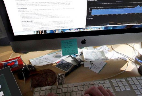
Check out Kord Campbell’s killer rig, complete with four monitors, at least two computers, two keyboards, an iPhone and an iPad.

Now, I don’t necessarily believe that multitasking is a bad thing, nor do I agree with Nicholas Carr and his assertion that the internet is ruining our ability to think.

I do believe, however, that multitasking and the ready availability of always-on, always-connected technology adversely affects my quality of life in many ways. And I do believe that I personally do not have the faculties necessary to deliberately manage these multiple, constant threads of information on my own.

Thus, my retreats into the woods. Externally-imposed isolation, where connectedness is not an option, is a very different beast than self-imposed isolation, and one I am far more fit to manage.

So, when I look at Campbell’s rig, I do not see it as an ideal to which to aspire, nor do I see it as a symbol of a computer-mediated life gone to horrible extreme. I simply see it as one person’s elaborate setup, their attempt to deal with the deluge of modern information, and I find it valuable and fascinating in its own right. I am here to observe, to sense-make, not to judge.

Really, I believe a focus on the number of screens misses the point, and what I find most interesting is the ecosystem that Campbell has created for himself.

Most poignant for me is the lowly Post-it Note, hanging off his primary monitor, front-and-center. For all the screens, all the software, the physical and spatial world was still implicated to record, display and remind Campbell of a few pressing tasks:

  • Signup breaks on template
  • Missing [frigge?] in add input
  • Trailing slashes on add input
  • Password reset issues

All recorded with pen and Post-it, and slapped up front on a 27″ monitor.

For all our screens, the physical, embodied world still holds significance and its own, rich meanings.