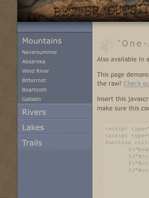
Accordion menus, collapsing navigation, f’eh. Everyone’s got their own version, including the one native to jQuery UI. I’ve never really been satisfied with any of them, however, so I took a stab at rolling my own. I built it in two versions, one that only allows you to have one navigation section open one at a time, and one that allows multiple sections.
If you have poor impulse control and just want to skip to the code demos, you can check out the implementations here:
Stylized “One-At-A-Time” Collapsing Navigation
Stylized “Many-At-A-Time” Collapsing Navigation
Making the magic sauce.
Here’s the basic code that makes it happen. I’ll only outline the “one-at-a-time” implementation here, but the “many-at-a-time” version is remarkably similar. All these code examples are available on the demo pages as well.
First, use this HTML code, or something similar to it. Basically, what you need is a series of double-nested unordered lists with the proper ID.
<ul id="collapsing-nav">
	<li><span>Main Nav One</span>
		<ul>
			<li><a href="#">Sub Nav One</a></li>
			<li><a href="#">Sub Nav Two</a></li>
			<li><a href="#">Sub Nav Three</a></li>
		</ul>
	</li>
	<li><span>Main Nav Two</span>
		<ul>
			<li><a href="#">Sub Nav One</a></li>
			<li><a href="#">Sub Nav Two</a></li>
			<li><a href="#">Sub Nav Three</a></li>
		</ul>
	</li>
	<li><span>Main Nav Three</span>
		<ul>
			<li><a href="#">Sub Nav One</a></li>
			<li><a href="#">Sub Nav Two</a></li>
			<li><a href="#">Sub Nav Three</a></li>
		</ul>
	</li>
</ul>
Next, these are the raw CSS styles that you’ll need to create the effect. Once you understand what’s going on, feel free to customize these rules however you see fit.
<style type="text/css">
	ul#collapsing-nav li a {
		color: #00f;
		text-decoration: underline;
	}

	ul#collapsing-nav li a:hover {
		color: #f00;
	}

	body.enhanced ul#collapsing-nav span {
		color: #00f;
		text-decoration: underline;
	}

	body.enhanced ul#collapsing-nav span:hover {
		color: #f00;
		cursor: pointer;
	}

	body.enhanced ul#collapsing-nav li.selected span,
	body.enhanced ul#collapsing-nav li.selected span:hover {
		color: #000;
		cursor: default;
		text-decoration: none;
	}
</style>
Finally, insert this JavaScript in the <head> of your HTML page. Also, grab a copy of jQuery and make sure this code points to that file as well.
<script type="text/javascript" src="jquery.js"></script>
<script type="text/javascript">
function collapsing_nav() {
	$("body").addClass("enhanced");
	$("#collapsing-nav > li:first").addClass("selected");
	$("#collapsing-nav > li").not(":first").find("ul").hide();
	$("#collapsing-nav > li span").click(function() {
		if ($(this).parent().find("ul").is(":hidden")) {
			$("#collapsing-nav ul:visible").slideUp("fast");
			$("#collapsing-nav > li").removeClass("selected");
			$(this).parent().addClass("selected");
			$(this).parent().find("ul").slideDown("fast");
		}
	});
}
$(collapsing_nav);
</script>
The above code adds an “enhanced” class to the <body> element, marks the first navigation section in the unordered list with a “selected” class, and hides all the remaining sections. When the user clicks on a section heading it hides any open navigation sections, reveals the section that corresponds to the clicked heading, and marks that section as selected.
If you want to see this basic code in action, visit the basic demo page or download these code examples for your own nefarious purposes.
There are a few things that make this collapsing navigation better than a lot of the other crud out there. While I certainly wouldn’t purport that this is the best of the best, I’ve found it to be perfectly suitable for many of my purposes.
It’s easy to implement and customize.
Just add the proper ID to a double-nested unordered list with the proper HTML markup, and you’re good to go. You’ll have to do some work with the CSS to get it to look good and behave just the way you want, but in the basic code example I’ve sketched out the behavioral CSS scaffolding that you’ll need to get off the ground. In the designed example I’ve compartmentalized the CSS rules across a few files, to clearly delineate what code applies to the navigation, and what is purely ornamentation.
It’s compatible.
I’ve tested these examples and they work perfectly in Safari 3.2.1, Firefox 3.0.6, Opera 9.63 and Internet Explorer 7.0. They work in IE 6.0 as well, with one small caveat: IE6 doesn’t support the :hover pseudo-class on any element other than <a> elements, and since the section headings use spans instead of hyperlinks, the hover state doesn’t work. This is a bummer, but if you tweaked the JavaScript to add an “ie-hover” class to the <span> element on hover, and if you defined that class in the CSS, you could totally work around this. For me it isn’t worth the effort, as I believe that IE6 users should be forced to browse the web in constant agony. For you, this activity could be a learning experience.
It’s lightweight.
Simply bring in 46KB of jQuery hotness, and the JavaScript and CSS to make this puppy work weighs less than 5KB.
It degrades gracefully with JavaScript turned off.
All nested lists are displayed wide open by default, so all navigation items are available to the user. Additionally, when JavaScript is disabled the section headings are not hyperlinked and are not clickable, as one would reasonably expect, considering that the only reason they should be clickable is to toggle the list. Without JavaScript to collapse and uncollapse the navigation, the hyperlink would serve no purpose other than to confuse the user. Indeed, if something isn’t clickable in a particular use case, it shouldn’t have an affordance that suggests otherwise. This lack of attention to detail in so many slipshod JavaScript snippets annoys me to no end.
I achieve this effect by using <span> elements (rather than <a> elements) to wrap the first-level list items. These spans could certainly be replaced by something like a header element that would more semantically descriptive, but such is a task I leave up to the reader. Then, with JavaScript I add an “enhanced” class to the <body> element, which calls in the basic CSS styles that control the presentation of the first-level list items and make them behave as clickable headings. This abstraction of presentation and behavior ensures that the collapsing navigation works as expected in most cases, and that those browsing without JavaScript will enjoy an experience unsullied by irrelevant controls.
It behaves the way you think it should.
Which is more than you can say about a lot of collapsing menus out there.
The section headers aren’t clickable when they shouldn’t be clickable, such as when they’re already expanded in the “one-at-a-time” example, or in cases where JavaScript is disabled.
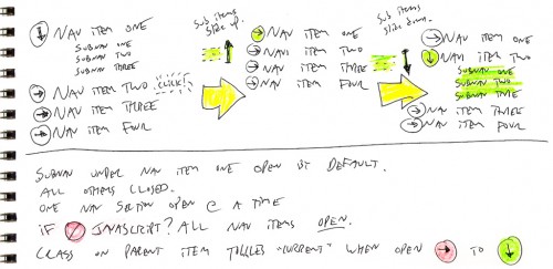
As with all of the things I design these days, I didn’t start with code when I set out to build this navigation. I started with sketching, which helped me better grasp the behavioral requirements of such a navigation scheme.

Sketching helped me realize one core problem that needed to be solved, that the first item in the list needed to be expanded by default. Indeed, there’s no reason that all navigation items should start out closed, as that’s lazy and inane. Second, this offers an affordance to the user, suggesting the behavior that can be expected from the other navigation items.
So that’s that. Visit the demo page to see the hotness stylized, or check out the basic code that makes the magic happen.


10 Comments
Works well in the safari browser on the iPhone.
Oh I forgot to mention if your using this in a public website you could reference the google jquery.js file. There are two benefits the first is speed as many of the ppl accessing your site will already have a copy of the file in their browsers cache. The second is less bandwidth usage on your site.
Cool! Thanks, Charlie!
You’re a good man for documenting this. Thanks Dane!
I recently hired a local firm to modify the website above to include a menu with dropdowns [see their demo at: http://clients.sumdes.com/RAI/%5D. And though it works fine on my older system and my laptop, for some reason they are unable to identify, the dropdowns don’t work on my desktop system [running XP]. I have tried it in IE and in Firefox with no success. Also, I have turned off my firewall, my popup blocker, reinstalled the latest service pack and software updates for IE and reinstalled the latest version of JAVA. But they have thrown up their hands and said “We’ve tested this in Opera, Firefox (windows and mac), Safari, Google Chrome, IE 6, 7, and 8 and even in the iPhone Safari browser. Everything works perfectly.” I finally looked into the code and discovered that they are probably using your Google API, so I wonder if you (or anyone) have any idea what’s wrong.
One more point: your examples (above “One-At-A-Time†Collapsing Navigation and “Many-At-A-Time†Collapsing Navigation) don’t work for me either.
Both examples work for me on Windows XP with Internet Explorer 6 and Internet Explorer 7.
Menu works great! Thank you! however, when I’m, let’s say, on a third page in a second section, the menu still opens the first section, probably because of this line:
$(“#collapsing-nav > li:first”).addClass(“selected”);
(just a guess, I don’t really know JS that well)
I have added IDs to all my tags, but I don’t know how to call them.
Can you help?
Hi Kate,
Thanks for the message! Unfortunately the script is pretty simple, so it doesn’t know what page you are on in the site, or how that page would relate to the links in the navigation.
I whipped up a quick example that might work for your purposes:
Basic One-At-A-Time Collapsing Navigation “Smart” Edition
Stylized One-At-A-Time Collapsing Navigation “Smart” Edition
It checks for a class assigned to your “body” element, and sees if that class corresponds to a class assigned to one of the sections in the collapsing navigation. If the class of the “body” and the class of the “li” match one another, it displays that section. Otherwise, it defaults to displaying the first section.
The class I’m using is “section-x”, where x is the number of the section. So, when you’re playing with the code, try changing the class of the body to a different number, to trigger a different section to open by default.
I commented the code in these examples as well, to make it a bit more clear what’s going on.
Hope this helps!
Also, for anyone who wants to have nested list items, I created an example that works for infinitely nested navigation elements:
Basic Many-At-A-Time Collapsing Navigation “Infinite Depth” Edition
The green “hyperlink” color is merely diagnostic, and helps to visually distinguish real hyperlinks from navigation controls.